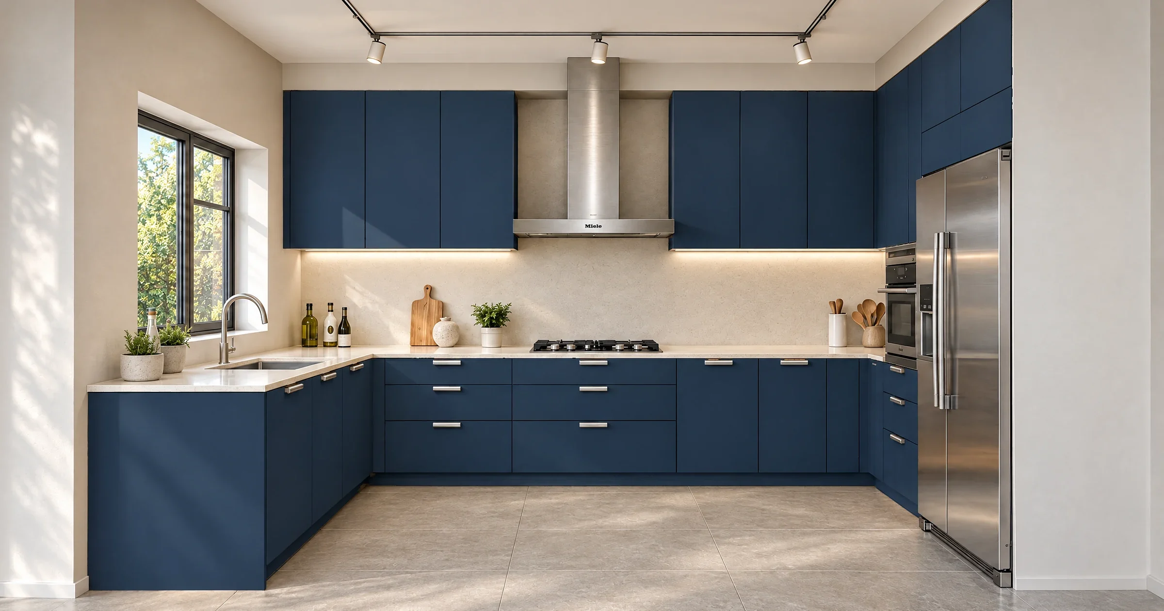
Changing the cabinet finish affects most of what you see in this kitchen. The doors run across the back wall, around the sink and up to the ceiling beside the refrigerator. A small swatch cannot show how that much oak, green or blue will look together.
This AI kitchen remodel example compares five finishes made with Vibe3D's Render mode: light oak, sage, charcoal, sand and navy. The source is a kitchen model view; the results are AI visualizations, not photographs of a completed renovation. Use them to narrow a finish shortlist before comparing physical samples.
The starting kitchen
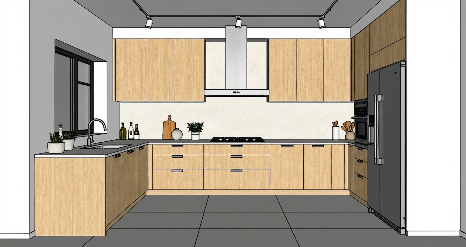
The input already has wood-tone fronts, pale counters and dark floor tiles. The five renders make those surfaces more realistic and explore different cabinet finishes. They also introduce sunlight, under-cabinet lighting and an outdoor view. Compare the rendered options with each other for color, then return to this source when checking the design details.
Five cabinet finishes compared
Light oak
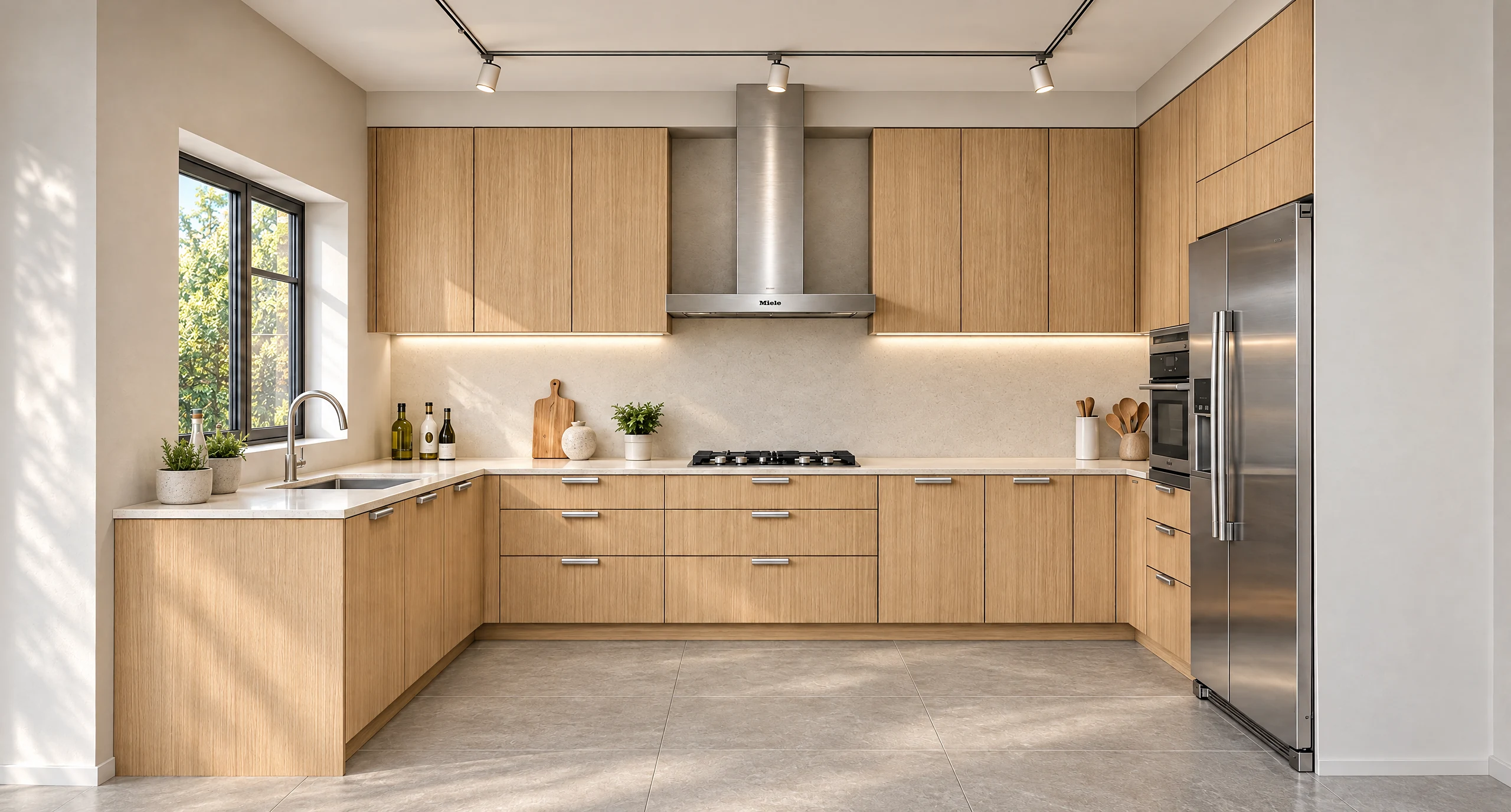
Oak stays closest to the wood-tone input. With so many upper cabinets, the grain becomes a large part of the room rather than a small accent. The pale backsplash separates the two rows, while the steel hood breaks up the wood above the cooktop.
If this is your preferred direction, ask to see a full door sample. Check grain direction and how adjacent doors would match; the render does not specify a veneer cut or a manufactured door finish.
Muted sage
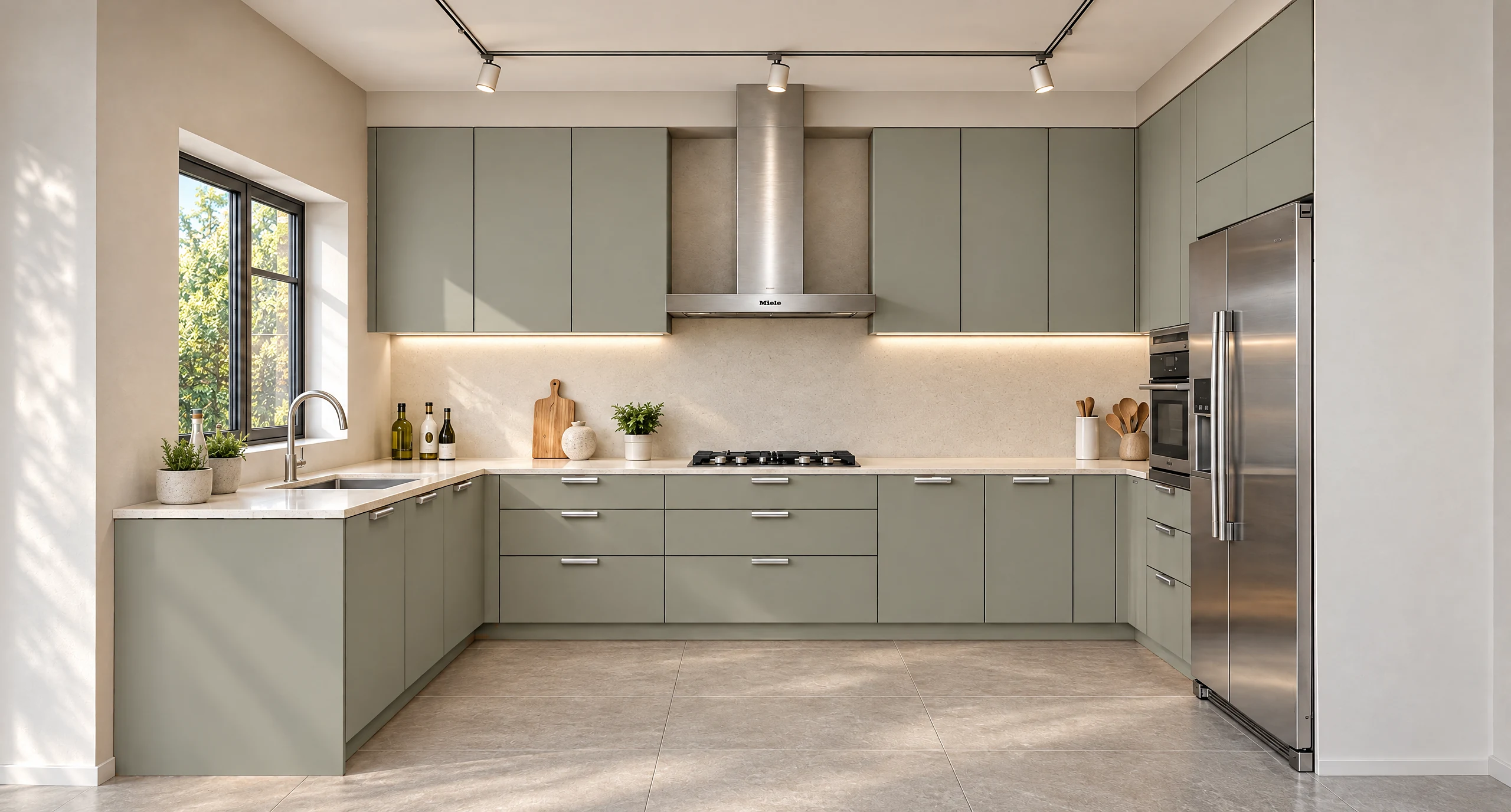
The sage version replaces the wood grain with a broad, even color. In this light it reads as gray-green, with less contrast against the backsplash than charcoal or navy. The handles and door seams remain visible without becoming the main feature.
Compare a green sample beside the actual worktop. A muted finish can look grayer in one light and greener in another, so check it by the window and under the kitchen's evening lighting.
Charcoal
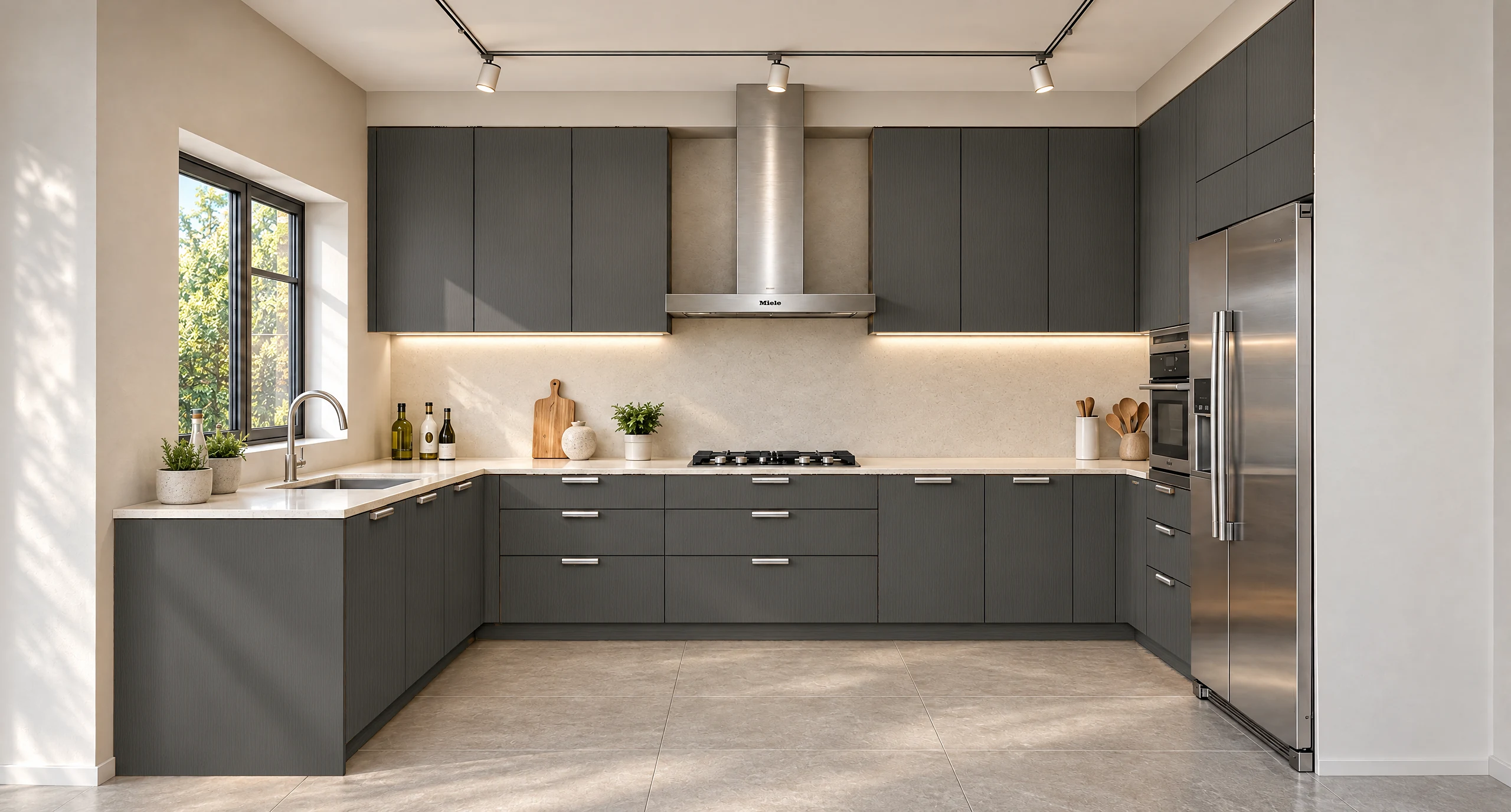
Charcoal makes the full run of upper cupboards feel more prominent. The backsplash becomes a bright horizontal band, and the steel hood and refrigerator are easier to pick out against the dark doors.
The daylight on the left and the under-cabinet light help this version stay readable. If your kitchen has a smaller window or no task lighting, do not assume it will look this bright. Check a darker finish under the light you actually have.
Warm sand
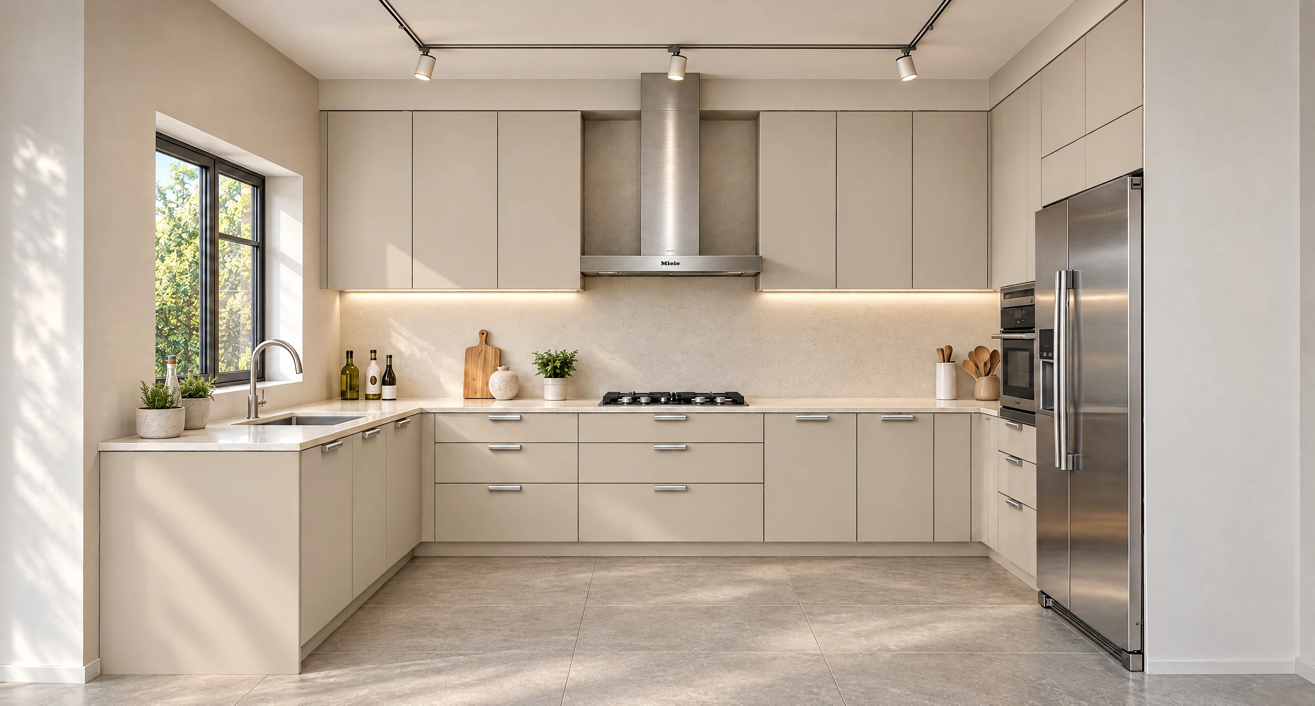
Sand gives the least separation between the cabinets and the surrounding room. Door seams, handles and shadows do more of the work of defining the cabinetry. Compare the upper doors beside the hood with the same area in the charcoal image to see the difference.
Take the cabinet, counter and backsplash samples to the same review. Three finishes that each look neutral on their own can show different yellow, pink or gray undertones when placed together.
Deep navy
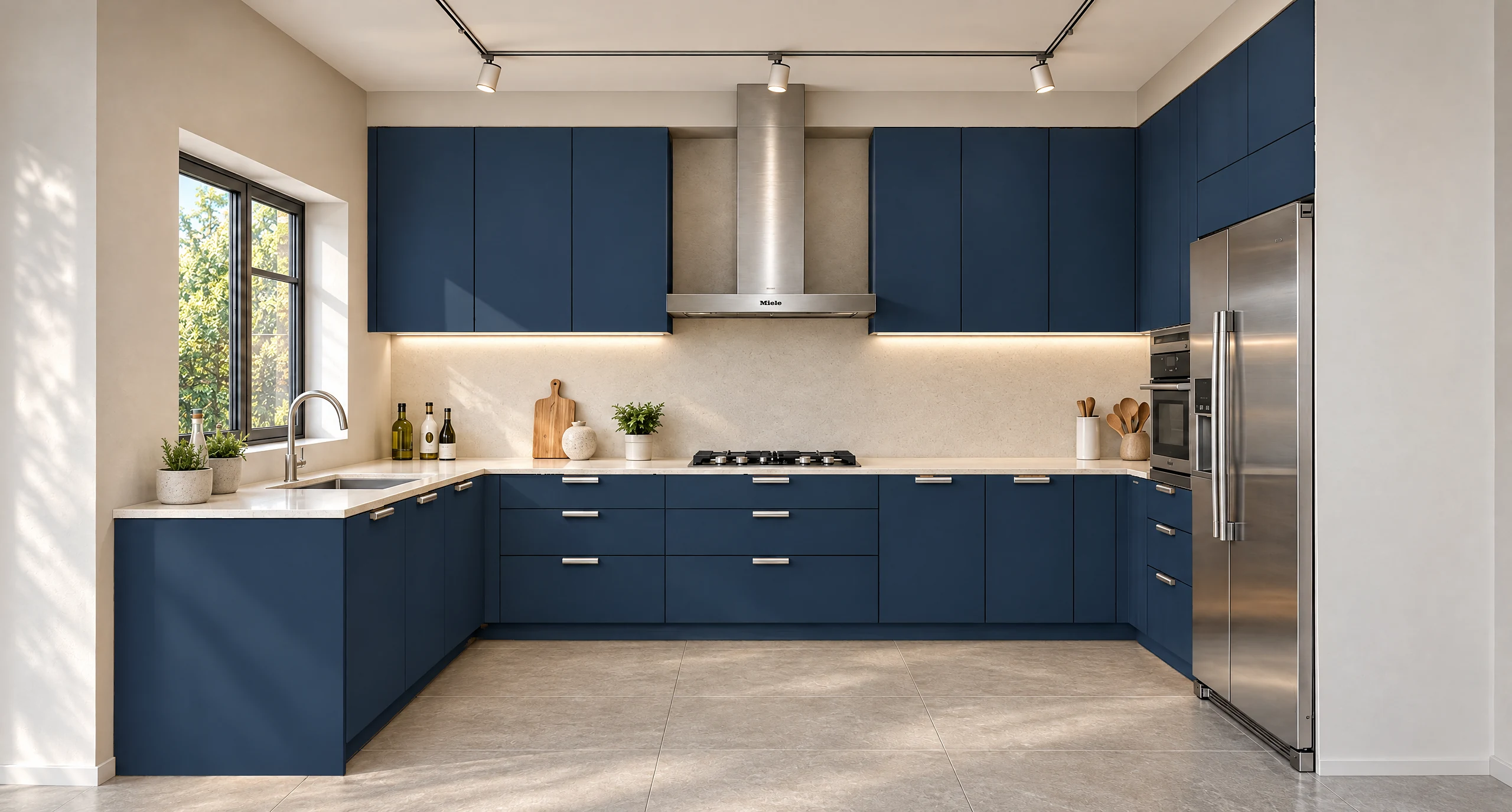
Navy keeps the strong light-to-dark contrast of charcoal but adds an obvious blue. On the left return, sunlight lifts the color; the shaded upper cupboards on the right look darker. That variation is worth checking on a sample before choosing from a screen.
The navy and charcoal images are a useful pair to compare if you already want dark cabinets. If both feel too dominant across the upper cupboards, a lighter upper-cabinet finish would be a separate option to render next. It is not shown in this set.
How to try this on your kitchen
Use Vibe3D's AI kitchen design workflow with a clear kitchen photo or model view that you have permission to use. Include the upper and lower cabinets, counters and nearby flooring in the frame so you can judge them together.
- Keep the source image available. For a new comparison, return to that source for each finish instead of repeatedly changing an already-generated result.
- Use Render mode and describe the cabinet finish you want. Keep the rest of your brief and the available lighting settings consistent between options.
- Name the surfaces that should remain unchanged, including the worktop, backsplash and floor. This is an instruction to the model, not a lock on those surfaces.
- Save the useful results with their briefs. Inspect the cabinet divisions and appliance details before showing a shortlist to someone else.
For example, you could start with:
Use light oak veneer with subtle straight grain on the upper and lower cabinet fronts. Keep the cabinet divisions, handles, appliance positions, sink, window and camera view from the source. Keep the worktop, backsplash and flooring unchanged. Do not add an island or new furniture.
This is a suggested starting brief, not the recorded prompt for the images above. For other options, replace the first sentence with a request for muted sage-green, charcoal-gray, sand-beige or deep navy cabinet fronts. The downloadable example briefs collect all five versions.
If you have chosen a render and only want to change one surface, follow the kitchen-material editing guide for selected-area edits. The images in this article were made in Render mode, not with that targeted Edit workflow.
What to check before choosing a finish
At a glance, the renders keep the recognizable arrangement of the source: sink on the left, hood in the middle and refrigerator on the right. That is not enough to approve the design. Look at individual handles, door widths, drawer divisions and the edges around appliances. Notice that the dark floor in the source becomes a lighter stone-like surface in the results, too.
For this kitchen, oak and sand would be a useful first pair to sample if you want a lighter palette: one has visible grain and the other is mostly even color. Compare navy with charcoal if you want stronger contrast. Sage sits between those groups in this set. These are visual shortlists, not paint matches or product specifications.
Before ordering, check physical cabinet samples with the actual counter and flooring in the room. Use measured drawings for dimensions and clearances. A render cannot establish a remodel budget, product availability or whether an appliance fits; those need supplier information and a measured design.
For the broader process of developing a room concept, see the AI interior design guide. The AI bathroom design example covers a different room where the same source-checking habit matters.