Think of an interior design concept sheet as the bridge connecting a client's dream to a real, buildable space. It’s a single, carefully put-together document that lays out the project's core feeling—the colour story, the textures, and the key furniture shapes—long before anyone clicks "buy now."
Why Your Project Absolutely Needs a Concept Sheet
Let's get one thing straight right away. A concept sheet is not just a prettier mood board. While a mood board is great for capturing an abstract vibe or a fleeting feeling, a concept sheet is your project's roadmap. This is where you actually define the soul of the space.
It’s a seriously powerful communication tool. It closes the gap between a client's fuzzy ideas ("I want it to feel cosy but modern") and the specific, tangible elements needed to make that happen. When you get everyone on the same page—from the client to the contractors—you sidestep expensive mistakes and the dreaded cycle of endless revisions later on. It's about building a solid visual case for the design you're proposing.
The Secret to a Smooth-Running Project
Honestly, a great concept sheet is the bedrock of a smooth project. It's more than just a collection of nice images; it's a strategic guide that shapes every single decision that follows. This kind of upfront planning is crucial, and it shares a lot of DNA with the broader strategies you can find in our guide to architectural design concepts.
An effective concept sheet translates feelings into a concrete plan. It says, "Here is the exact shade of blue, the specific velvet texture, and the style of sofa that will create the calm, sophisticated living room we discussed."
When you nail this document, you accomplish a few critical things all at once:
-
You Establish Crystal-Clear Clarity: It locks in the design direction in a way that’s visual and easy for anyone to grasp. No jargon needed.
-
You Secure That All-Important Buy-In: It lets clients see, touch (if it's physical), and approve the core ideas before you invest serious time or money.
-
You Guide the Entire Execution: It acts as a constant touchstone for the whole team, making sure the finished room is cohesive and stays true to that initial vision.
Gathering Your Essential Project Intel
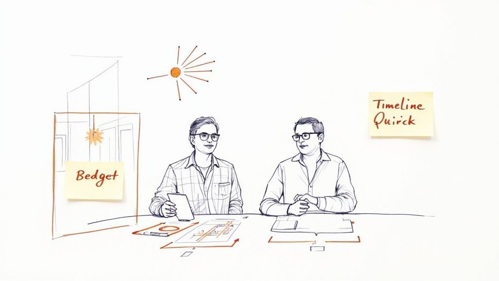
It’s so tempting to jump straight onto Pinterest and start pinning, but hold on. The most successful interior design concept sheet isn’t built on a foundation of pretty pictures; it’s built on solid, real-world information. This is the groundwork phase, and honestly, it’s where the magic really starts.
Think of your first meeting with a client less like an interview and more like a discovery session. Your mission is to figure out what they really want, even if they don't quite have the words for it themselves. This means going way beyond "What colours do you like?"
Digging Deeper Than the Surface
To get to the heart of the project, you need to understand their lifestyle. Ask questions that get them talking about their daily routines and how they use their space now.
-
"How do you want to feel when you walk into this room after a long day?"
-
"What's the one thing that drives you crazy about this space right now?"
-
"Describe your ideal Saturday morning at home. What are you doing?"
These kinds of questions get you the "why" behind the project, which is so much more valuable than just the "what." A client might say they want a “minimalist” look, but what they often mean is they’re craving an organised, clutter-free home, not necessarily a sterile white box.
The most important intel you can gather is emotional. Understanding how a client lives and dreams is the key to creating a space that resonates on a personal level, turning a good design into a great one.
Assessing the Physical Space
Once you’ve got a handle on the human side of things, it’s time to get practical. The space itself has its own story to tell, with clues and constraints that will shape your entire concept.
A proper site analysis is more than just measuring walls; it’s about really understanding the canvas you're working with. Take note of the unchangeable truths of the room. How does the natural light move throughout the day? A south-facing room has a completely different vibe to a north-facing one. Look for architectural quirks—that oddly placed window or structural beam isn't a problem, it's a creative opportunity.
For larger, more complex properties, getting a detailed overview is a must. You can learn more about how a professional site plan rendering can help you visualise the entire layout before you even start.
Finally, lay down the practical guardrails. Get a firm grip on the budget, set a realistic timeline, and nail down the project's main goals. With all this intel in hand—the client's vision, the site's reality, and the project's parameters—you're ready to build an interior design concept sheet that is not just inspiring, but completely achievable.
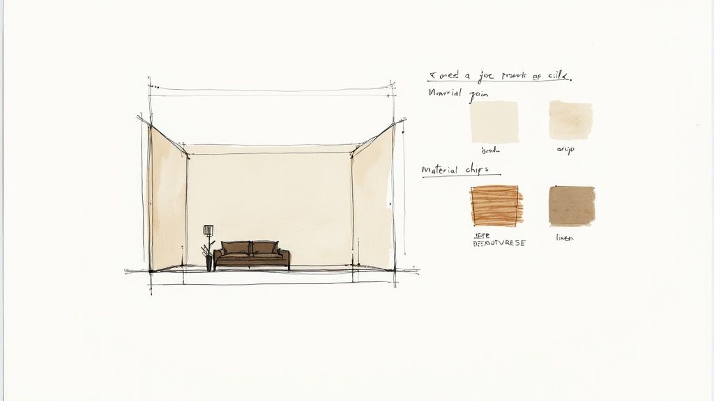
Curating Your Visual and Material Palette
Right, you’ve got all the essential project info nailed down. Now for the fun part—the bit where you get to play curator and bring the client’s vision to life. This is where your creativity really kicks in as you sift through a world of possibilities to find that perfect mix of colours, materials, and visuals. The aim is to build a palette that feels both deliberate and deeply personal to the project.
Forget just grabbing the latest trends off Pinterest. This is about taking that feeling you unearthed during your initial chats and turning it into something tangible. If the brief was "a calm, coastal retreat," this is where you hunt down the specific soft blues, weathered woods, and linen textures that actually deliver that vibe.
Building Your Colour Story
Colour is the emotional heart of any design, so it’s the natural starting point. A great palette does more than just fill a space with colour; it sets the entire mood. Don't box yourself in with just paint swatches. I often pull colours from a piece of art, a beautiful textile, or even a landscape photo that captures the right feel.
-
The 60-30-10 Rule: It’s a classic for a reason. 60% of your palette is your dominant colour (think walls), 30% is your secondary (for furniture and rugs), and the final 10% is your accent (for those little pops in cushions and decor).
-
Go Beyond Paint Chips: Always gather physical or digital samples of fabrics, wood finishes, and metal tones. This is the only way to truly see how colours play with different textures and light.
What you're after is a harmonious collection where every element works together. This is the moment you decide if the space will feel energetic and bold or serene and muted. Every single choice should tie back to the core concept you defined earlier.
Selecting Materials and Textures
Next up, you start layering in the materials that will give the space its depth and character. This is where the design becomes something you can touch and feel. I always encourage designers to think about the physical experience of being in the room—the plush feel of a velvet sofa, the cool touch of a marble countertop, or the ruggedness of an exposed brick wall.
Your material selection should be a smart mix of hard and soft finishes that balance each other out.
For instance:
-
Hard Surfaces: This includes things like wood flooring, stone countertops, metal fixtures, and ceramic tiles.
-
Soft Surfaces: Think upholstery fabrics, lush rugs, elegant drapery, and throw cushions.
As you're putting this all together, don't forget the architectural elements already in the room. A great set of windows can be a huge source of inspiration. Checking out some top window design ideas for your home can spark some brilliant ways to handle natural light and framing.
The Rise of Digital Curation
While I’ll always have a soft spot for a physical sample tray, there's no denying that digital tools are taking over how we build these palettes. This shift has been massive, especially in growing markets.
In India, for instance, a huge number of interior design firms now rely on digital tools to create and share their concepts. We've seen the adoption rate for interior design software there jump from around 30% in 2018 to over 68% recently, largely because high-quality global software is just so much more accessible.
Digital tools don't just speed things up; they allow for incredibly quick changes and even stunning 3D visualisations, giving clients a much clearer, more exciting picture of what they’re getting.
Whether you're working with physical swatches or a digital canvas, the principle is identical. You're piecing together a cohesive collection of elements that tell a powerful story. For those of us working digitally, getting comfortable with tools like 3ds Max is a real game-changer. Our guide on using 3ds Max for interior design has some great insights for creating visuals that truly sell your ideas.
Ultimately, your goal is to present a curated palette that makes your design vision feel completely undeniable.
Arranging Your Concept Sheet for Maximum Impact
So, you've gathered a fantastic collection of images, materials, and colours. That’s the fun part. But how you actually arrange them on the interior design concept sheet is what makes or breaks your presentation. A cluttered, chaotic board can make even the most brilliant ideas fall flat. The real skill is in the composition—creating a visual story that guides your client’s eye and gets them excited.
Think of it like a magazine layout. You don’t just randomly toss images onto a page. Each element is placed with intention to create an experience. Your concept sheet deserves that same level of care. You need to establish a clear visual hierarchy. What’s the star of the show? Is it a breathtaking hero image? A key piece of furniture? That element should be the first thing your client’s eye is drawn to.
Establishing a Clear Visual Flow
The easiest way to create that hierarchy is to play with scale. Make your main inspiration image significantly larger than the supporting ones. Then, you can group smaller items like fabric swatches and paint chips together in a neat, organised block. This simple trick instantly transforms a random collection of items into a cohesive, well-considered plan.
This diagram breaks down how you can structure your palette, moving from the big-picture vision right down to the specific details.
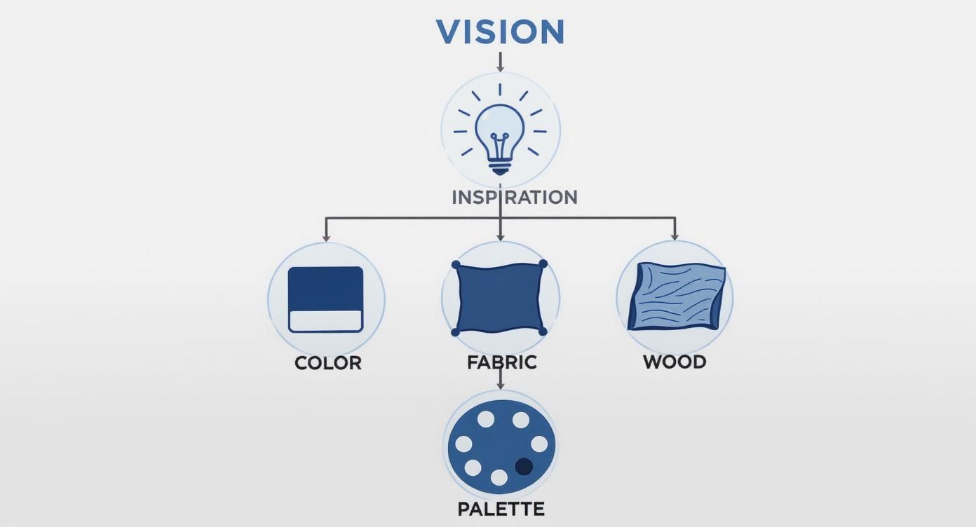
It’s a great way to show a client how the broad vision translates into tangible components, making the whole design process feel logical and easy to grasp.
Next up, let's talk about white space. Don't be afraid to leave some areas blank! White space (or negative space, as it's often called) is the breathing room on your page. It gives each element space to shine, separates different ideas, and dramatically reduces that feeling of visual clutter. A crowded board feels overwhelming, but a board with plenty of white space feels calm, confident, and utterly professional.
A well-organised concept sheet does more than just present ideas; it builds trust. It shows the client you are not just a creative, but also a strategic thinker who can execute a plan with precision and care.
To tie it all together, here’s a look at the essential components that make a concept sheet layout truly effective.
Essential Components for a Winning Concept Sheet Layout
| Element | Purpose and Best Practice |
|---|---|
| Hero Image | This is your showstopper. It should be the largest visual and immediately capture the mood and style of the design. |
| Colour Palette | Display 5-7 key colours in clear swatches. Label them and arrange them logically, perhaps from dominant to accent. |
| Material Swatches | Include photos or scans of key materials like flooring, fabrics, and finishes. Group them together to show how they interact. |
| Furniture & Lighting | Showcase key pieces with clean, cut-out images. This helps the client focus on the form and style without a distracting background. |
| Annotations | Use short, descriptive text to explain the why. For example, "Scratch-resistant flooring for pet-friendly living." |
| White Space | Don't overcrowd the page. Use negative space to create a clean, professional look and guide the viewer's eye. |
Having this structure ensures you've covered all your bases and presented your vision in a way that’s both beautiful and easy for the client to understand.
Adding Clarity with Annotations
Finally, and this is a big one, don't make your client guess what you're thinking. Use small, simple text annotations to explain your choices. A quick note like, "Durable, family-friendly velvet for the main sofa" or "Warm brass accents to complement the cool blue tones" adds incredible value. It instantly connects the visuals back to the project goals you discussed, reinforcing that every single choice is deliberate.
These little notes transform your concept sheet from just a pretty picture into a strategic document. They answer the "why" behind your design, making your presentation far more compelling and heading off potential misunderstandings.
For those of you working with 3D models, knowing how to render in SketchUp can be a total game-changer, allowing you to create the kind of high-impact imagery that really makes a concept sheet pop. When you balance powerful images with a thoughtful layout and clear communication, your concept sheet becomes an unstoppable tool for getting that enthusiastic "yes!" from your client.
How to Present Your Concept and Win Over Clients
https://www.youtube.com/embed/MfMxypJNOQY
You’ve poured your creativity into crafting the perfect interior design concept sheet. Now for the moment of truth: presenting it to your client in a way that makes them feel seen, heard, and genuinely excited.
A great presentation isn’t you just talking at them; it's a conversation. The whole point is to connect every single choice you’ve made directly back to their original goals and dreams for the space.
The best way to do this is by telling a story. Start by gently reminding them of the initial brief—the problems they wanted to solve and the feelings they hoped to create. Then, walk them through your concept sheet, almost like a guided tour. Explain how each fabric, finish, and furniture piece on that board is a direct answer to their needs.
Don't just say, "Here’s a blue sofa." Instead, try something like, "Remember how you wanted a cosy, enveloping feel for your family movie nights? I chose this deep navy velvet for the sofa to bring that exact feeling to life." Suddenly, it’s not just a sofa; it’s a solution.
This narrative approach makes a world of difference. Your concept sheet is a key part of your professional presentation materials, and treating it with this storytelling care shows your client how deeply you've considered their vision.
Navigating Feedback and Questions
One of the best ways to build trust is to anticipate their questions before they even ask. If you've made a bold choice, like a dramatic wallpaper, be ready to talk about its scale in the room, its durability, and how it acts as the perfect anchor for the design.
When they do give feedback, listen first. Really listen. Try to understand the "why" behind their hesitation before you jump in with a defence.
A presentation isn't about defending your design; it's about demonstrating how your design defends their vision. Connect every choice back to their initial brief to build a powerful, undeniable case for your concept.
Sometimes, a client's hesitation isn't really about the specific item; it's about a fear of the unknown. They might struggle to visualise how it will all come together. This is where modern tools can be a game-changer. Showing them exactly how their space will look and feel with immersive tech can close that gap instantly. We actually dive deeper into this in our guide on virtual reality in interior design—it can be an incredibly persuasive tool.
Sealing the Deal with Confidence
Your own confidence is contagious. When you present your design with genuine belief and conviction, it reassures the client that they're in good hands.
This kind of professional assurance is more important than ever. Just look at the interior design market in India, which has seen massive growth. It reached an estimated value of USD 29.5 billion and is expected to climb to USD 48.1 billion by 2028. This boom is driven by clients who expect nothing less than clear, professional, and well-reasoned design presentations. If you're curious about these trends, you can read the full market analysis from Market Report Analytics.
In the end, your goal is to guide your client to an enthusiastic "yes!" By framing your concept sheet as the answer to their problems and the first step toward their dream home, you're doing more than just selling a design. You’re building a partnership built on trust, understanding, and a shared excitement for what's to come.
A Few Common Questions About Concept Sheets
Even when you have a solid process down, a few questions always seem to pop up when you're putting together an interior design concept sheet. Let's run through some of the most common ones I hear, just to clear the air and help you keep things moving.
What’s the Real Difference Between a Mood Board and a Concept Sheet?
This is the big one, probably the question I get asked the most. And it’s a good one!
Think of a mood board as your initial, often messy, brainstorming playground. It’s all about capturing a vibe, a feeling, a gut reaction. You're in the "what if?" stage, pulling together inspirational images that might not even be literal choices for the space. It’s pure emotion and ideas.
A concept sheet, on the other hand, is the strategic plan that grows out of that creative chaos. It’s specific, concrete, and actionable. Instead of just a dreamy picture of a cosy living room, your concept sheet will show the exact sofa you've sourced, a swatch of the specific fabric for the curtains, and the precise paint colour code for the walls.
The mood board is the dream; the concept sheet is the blueprint for making that dream a reality. It translates abstract feelings into concrete, purchasable, and buildable elements.
In a nutshell, one is for inspiration, the other is for execution. Your concept sheet becomes the document you and your client sign off on—the definitive guide for the entire project.
What Are the Best Tools for Creating a Digital Concept Sheet?
Honestly, the best tool is whatever helps you get your ideas across clearly and fits into how you already work. You absolutely don't need the flashiest or most expensive software to create a concept sheet that wows a client.
I've seen designers do brilliant work with tools they already have on their computers:
-
Canva: It's a crowd-pleaser for a reason. The drag-and-drop interface is a lifesaver when you need to pull a layout together quickly.
-
Adobe InDesign: If you're after that next-level polish, nothing beats InDesign for its control over typography and layout. Your concepts will look incredibly professional.
-
PowerPoint or Google Slides: Don't sleep on these! They are surprisingly good for creating clean, organised presentations that are a breeze to share and get feedback on.
If you want something a bit more specialised, platforms like Morpholio Board or SampleBoard are built just for us. They come packed with handy features like easy background removal and access to libraries of real products. The main thing is not to get bogged down by the tech. Focus on making your visual argument clear and persuasive.
How Should I Handle a Client Requesting Major Changes?
First things first: take a breath. Feedback and revisions are a totally normal—and healthy—part of the design process. When a client comes back with big changes, the first step is always to listen. Really listen. You need to understand the "why" behind their request.
Did you miss the mark on the overall feeling they wanted, or is it just one particular armchair they can't stand? I always find it helpful to circle back to the initial project brief and the goals you both agreed on. This can re-centre the conversation and gently remind everyone of the original vision.
Instead of asking a wide-open question like, "So, what do you want instead?", try presenting one or two pre-vetted alternatives for the pieces they've rejected. This shows you're taking their feedback on board while still guiding the design direction like the expert you are. It’s also smart to set expectations from the get-go by clarifying in your contract that your fee includes one or two rounds of revisions. This simple step keeps the project from getting stuck in an endless loop of changes.
Ready to turn your approved concepts into breathtaking, photorealistic visuals in seconds? Vibe3D is our AI-powered rendering platform that helps you show clients exactly how their space will look. Speed up approvals and bring your vision to life. Try Vibe3D today.