Concept Sheet Interior Design: Create a Client-Winning Presentation
Explore concept sheet interior design strategies to turn your vision into a compelling, client-winning concept with clear visuals and persuasive storytelling.
Dec 19, 2025

So, what exactly is a concept sheet in interior design? Think of it as the strategic blueprint for your project's entire look and feel. It’s a step beyond a simple mood board because it lays out specific, hand-picked elements—the exact colour palettes, material samples, key furniture pieces, and lighting fixtures that will bring the space to life. It’s how you turn a vague idea into a solid plan your client can see and approve.
Why Your Concept Sheet Is Your Most Important Client Tool
Before you even think about pulling fabric swatches or paint chips, we need to talk about why the concept sheet is so crucial. It's not just a pretty collage to get the client excited; it’s the strategic foundation that aligns everyone involved, from you and your client right through to your contractors.
Essentially, it's the visual contract that translates abstract client requests like 'cosy' or 'modern' into a tangible, actionable plan.
This single document is your best defence against miscommunication and the dreaded scope creep. It’s where you get that confident, enthusiastic 'yes' from your client, kicking off the project with momentum and crystal-clear clarity.
Aligning Vision and Reality
A thoughtfully put-together concept sheet closes the gap between your professional vision and what your client is picturing in their head. It’s a powerful communication tool that nips costly revisions in the bud by getting everyone to agree on the core design direction right from the start.
A great concept sheet does more than present ideas; it builds trust. It demonstrates that you have listened carefully and can translate feelings into a concrete plan, proving you are not just a creative but a strategic partner.
When a client can see the specific velvet texture for the sofa right next to the exact shade of blue for the walls, all that ambiguity just melts away. This upfront clarity is absolutely essential for understanding how to effectively start the interior design process from day one.
The Bedrock of a Smooth Project
At the end of the day, a strong concept sheet is the bedrock of an efficient project. It manages to tick several critical boxes all at once:
Establishes Clear Direction: It locks in the aesthetic in a visual format that’s easy for everyone—including your tradespeople—to understand.
Secures Client Buy-In: It gives clients the chance to see, feel, and sign off on the core concepts before you’ve invested significant time or money.
Acts as a Project Guide: It becomes the go-to reference for the entire team, making sure the final space stays cohesive and true to that original vision.
This document works on many of the same principles as other high-level planning tools in the design world. You can see a similar approach in our detailed guide to the architectural concept sheet, which also hinges on getting that foundational alignment right from the get-go.
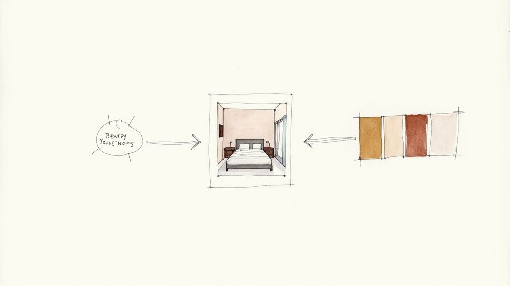
Bringing Your Design Story to Life: The Essential Elements
A great concept sheet doesn't just show a design; it tells a story. And like any good story, it needs the right ingredients to feel compelling. This is where we move from abstract client conversations about "calm" or "energetic" spaces and start building a visual language that feels both inspiring and totally concrete.
It all starts with capturing the atmosphere, that intangible feeling of the space. From there, we'll build out a specific colour palette and pull together a tactile selection of materials and finishes your client can almost reach out and touch.
Setting the Mood with a Strong Colour Story
Colour is the emotional heartbeat of any room, so it's always my first port of call. A thoughtful palette does so much more than just cover the walls—it dictates the entire mood from the moment someone walks in. I rarely start with just paint swatches. Instead, I find inspiration everywhere: a piece of art, a gorgeous textile, or even a landscape photo that perfectly captures the feeling we're aiming for.
The goal isn't just to pick colours, but to build a colour story. A tried-and-true framework I always come back to is the 60-30-10 rule. Your dominant colour (think walls) makes up 60% of the space, a secondary colour (furniture, rugs) takes up 30%, and the final 10% is reserved for those punchy accents (cushions, decor).
This simple guideline helps create a look that feels balanced and intentional, not chaotic. This is the stage where you decide if the space will be serene and muted or vibrant and bold. Every choice you make here should link directly back to that initial concept you hammered out with your client. Getting this emotional foundation right is crucial for creating powerful architectural design concepts that truly connect.
Before you present anything, it's a good idea to create a checklist of the core components. This ensures you've covered all your bases and your story is complete.
Core Components for a Winning Interior Design Concept Sheet
A checklist of the fundamental elements to include, ensuring your presentation is comprehensive, clear, and compelling.
Component | What to Include | Its Role in the Presentation |
|---|---|---|
Mood Board | Inspirational images, textures, and key phrases. | Establishes the overall feeling and emotional direction of the design. |
Colour Palette | 5-7 key colour swatches with names/codes. | Defines the visual harmony and sets the dominant, secondary, and accent tones. |
Materials & Finishes | Samples of flooring, tiles, fabrics, metals, and woods. | Adds texture and tangibility, making the design feel real and touchable. |
Key Furniture | Images or sketches of anchor pieces (sofa, bed, dining table). | Grounds the design and showcases the style and scale of core elements. |
Lighting Selections | Pendants, lamps, and sconces that fit the aesthetic. | Highlights how light will shape the mood and functionality of the space. |
Sketches or Renders | Quick perspective sketches or fast photoreal renders. | Provides a spatial context and helps the client visualise the final outcome. |
With these elements in hand, you've built a robust visual argument for your design.
Curating a Tactile Palette of Materials and Finishes
Next, we start layering in the materials that give the space its depth and character. This is where the design becomes something you can feel. I always encourage designers to think about the physical experience of being in the room—the softness of a velvet sofa against your skin, the cool smoothness of a marble countertop, or the rustic texture of an exposed brick wall.
Your material board should be a smart mix of hard and soft finishes that play off each other beautifully.
Hard Surfaces: This is your foundation. Think wood flooring, stone worktops, metal fixtures, and ceramic tiles. These elements form the architectural backbone of the room.
Soft Surfaces: This is where you bring in comfort. Upholstery fabrics, plush rugs, elegant drapery, and throw cushions add cosiness, absorb sound, and introduce new textures.
The choice of materials is absolutely critical. For instance, learning how to choose flooring color is a major decision point that sets the tone for everything else. A warm oak floor tells a completely different story than sleek, polished concrete.
Selecting Anchor Furniture and Statement Lighting
Once the mood and material palette are locked in, you can start picking out the stars of the show: the anchor furniture and key lighting fixtures. These aren't just functional items; they're the sculptural pieces that define the room's flow and personality.
Whether it’s a sleek, minimalist sofa for a modern loft or an ornate chandelier for a classic dining room, these selections should be a physical embodiment of your design concept.
By dropping in a few initial sketches, simple 2D layouts, or even fast photorealistic renders at this stage, you give the client a complete picture. It makes the entire vision feel tangible, achievable, and completely irresistible.
Designing Your Layout for Clarity and Impact
You've got all the right pieces for your design, but how you put them together on the page is just as important. A chaotic concept sheet interior design can make even the most stunning ideas fall flat. On the other hand, a well-thought-out layout guides your client’s eye, tells a compelling story, and instantly signals your professionalism.
Think of it as the difference between a scrapbook of random images and a cohesive, persuasive proposal. You're not just showing them things; you're leading them through your vision.
Creating a Clear Visual Flow
The most effective way to start is by establishing a clear visual hierarchy. You need to control where your client looks first. This means deciding on your "hero" element—is it the gorgeous render, the key inspiration photo, or the core colour palette?—and making sure it gets the most attention.
A simple trick I've used for years is to play with scale. Make your main image significantly larger than everything else. This immediately establishes it as the focal point. Then, group smaller, related items together, like clustering fabric swatches and paint chips into neat, organised blocks.
Suddenly, a jumble of ideas transforms into a well-considered plan. It shows the client you’re not just a creative with good taste, but a strategic thinker who knows how to bring a vision to life.
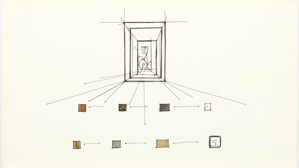
This chart shows how I often think about the hierarchy of design elements, starting with the overall feeling and then drilling down into the specific selections.
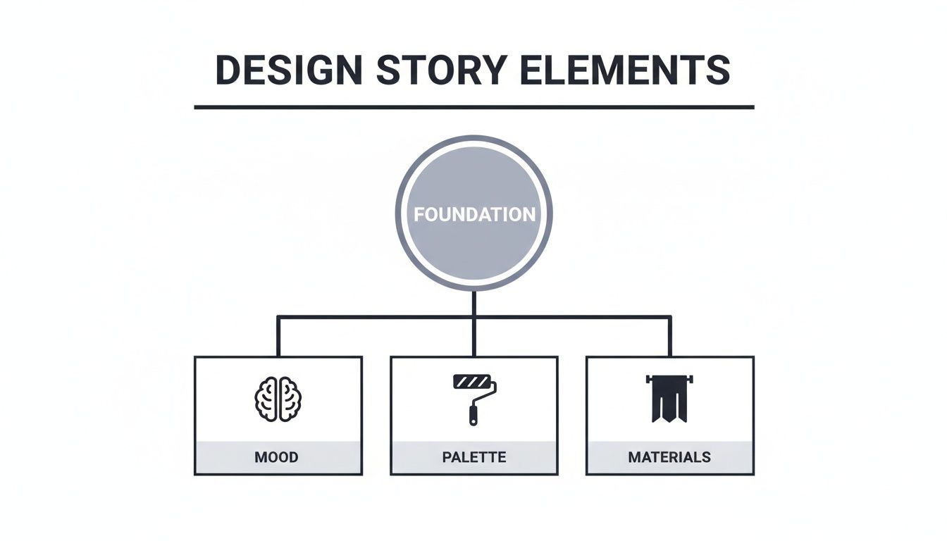
As you can see, the broader feeling of the space directly informs every tangible choice, from materials to colours.
The Power of White Space and Annotations
Never, ever underestimate the power of white space. Known as negative space, it's the breathing room on your page that prevents visual overload. A board that’s crammed with images feels chaotic and overwhelming. One with plenty of white space feels calm, confident, and sophisticated. It lets each element sing.
A well-organised concept sheet does more than just present your design; it builds client trust. It’s a silent testament to your ability to execute a plan with care and intention, proving you can bring order to a creative process.
Finally, bring it all home with clear annotations. Your client can't read your mind, so don't make them guess your thought process. Short, descriptive notes add incredible value by connecting the visuals back to their specific needs and goals.
Explain Your Logic: A simple note like, "Scratch-resistant flooring for a pet-friendly home," shows you were listening and that your choices are practical.
Highlight Connections: Draw their attention to the details. For example, "Warm brass fixtures to complement the cool blue cabinetry."
Reinforce the Vision: Keep your language focused on the why. Link every choice back to their initial brief and the feeling you want to create in the space.
These little text elements turn your concept sheet from a pretty picture into a strategic document. They answer questions before they're even asked, making your presentation far more compelling and preventing misunderstandings down the line.
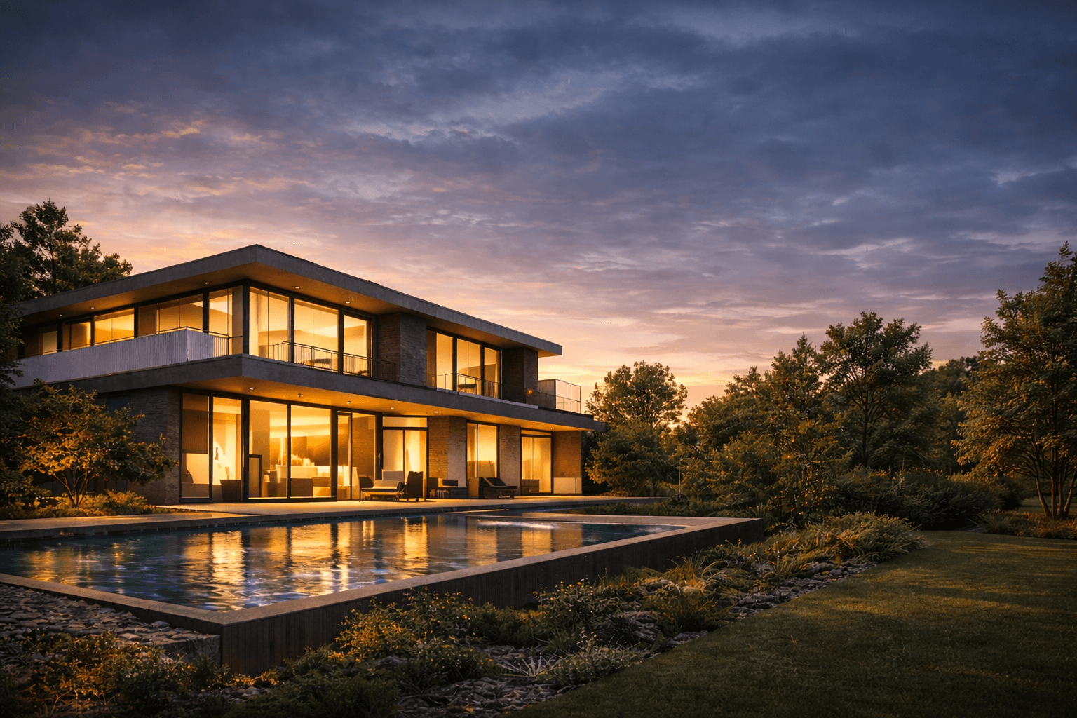
Bringing Your Design to Life with Realistic Renders
Material samples and mood images are essential, but let's be honest—nothing sells a vision like showing a client exactly what their future space will look like. While hand-drawn sketches have a certain raw energy, photorealistic renders are the tools that bridge that final, crucial gap between imagination and reality. They create a powerful emotional connection that static images and fabric swatches just can’t replicate on their own.
A high-quality render isn’t just a picture; it’s a preview of a future memory. It lets your client truly feel the interplay of light, texture, and scale in a way that resonates deeply. This is where your concept sheet interior design transforms from a collection of ideas into an immersive and utterly convincing presentation.
Making Renders the Centrepiece of Your Presentation
My advice? Don’t treat your renders like an afterthought. Instead, make one stunning visual the absolute focal point of your concept sheet. This "hero" image should be the first thing that grabs your client's attention. From there, you can surround it with the specific material swatches and colour palettes that bring that beautiful vision to life.
This approach creates a really effective narrative. The client sees the gorgeous finished room and then immediately discovers the tangible elements—the exact wood grain, the weave of the fabric, the precise paint colour—that make it possible. It’s a powerful one-two punch that makes the entire design feel both inspiring and achievable.
By leading with a render, you shift the conversation from "What do you think of these materials?" to "How excited are you to live in this space?" It transforms the presentation from a review of components into an experience of the final product.
This strategy is a game-changer for clients who struggle to visualise how everything will come together. It answers their biggest unspoken question—"How will this actually look?"—providing instant clarity and building their confidence in your design direction.
Integrating Renders Without Slowing Down Your Workflow
In the past, producing photorealistic visuals was a massive time-suck, something you’d only do for the final project sign-off. Thankfully, modern tools have completely flipped the script. We can now create incredible, high-quality visuals rapidly, making them a perfect fit for the early concept phase without grinding our creative momentum to a halt.
Fast rendering tools are built to fit seamlessly into a designer's workflow:
Quick Iterations: You can generate multiple design variations in a fraction of the time it used to take. Want to show them the sofa in blue and green? No problem. It allows you to explore different lighting, materials, and furniture options without blowing up your timeline.
AI-Powered Efficiency: Platforms like Vibe3D can turn your 3D models into stunning, photorealistic images in seconds, not hours. This means you can easily include several high-impact visuals right in your initial concept sheet.
Seamless Integration: Many of these rendering solutions plug directly into the design software you already use, so you can produce visuals without a complicated or overly technical setup.
By pulling these visuals into your process early on, you elevate the entire client conversation and speed up decision-making. To see just how much this technology can change your presentations, check out our complete guide to 3D rendering for interior design and explore how it can benefit your projects.
How to Present Your Concept and Guide Client Feedback
So you’ve poured your heart and soul into creating the perfect concept sheet interior design. Now for the big moment: the client presentation. A great presentation isn't just you talking at them; it's a collaborative conversation where every choice you've made clearly connects back to their original goals for the space.
Think of it as telling a story. Start by gently recapping the initial brief—the problems they wanted to solve and the feeling they hoped to create. From there, walk them through the concept sheet like a guided tour, explaining how each element is a deliberate answer to their needs.
Don't just point and say, "Here's a velvet sofa." Instead, weave it into their narrative. "Remember how you wanted a cosy, inviting space for family movie nights? I chose this deep navy velvet for its warmth and durability to bring that exact feeling to life." Suddenly, it’s not just a sofa; it's the solution they were looking for.
Navigating Feedback and Questions
Building trust often means having the answers ready before the questions even come up. If you've made a bold choice, like a dramatic wallpaper, be prepared to talk about its scale, durability, and how it anchors the entire room. When they do offer feedback, the most important thing is to listen first. Really try to understand the 'why' behind their hesitation before you jump in with a response.
A presentation isn't about defending your design; it's about demonstrating how your design defends their vision. Connect every choice back to the initial brief to build a powerful, undeniable case for your concept.
Sometimes, a client's hesitation isn't about a specific item but a fear of the unknown. They might struggle to visualise how all the individual pieces on the sheet will actually look together in their home. This is where modern tools can be a game-changer. Exploring how virtual reality in interior design can offer an immersive preview is an incredibly persuasive way to bridge that gap and build their confidence.
Sealing the Deal with Confidence
Your own confidence is contagious. When you present your design with genuine belief and enthusiasm, it reassures the client that they are in capable hands. This professional assurance is vital, especially in a competitive field. In the Indian interior design market, for instance, North India holds a dominant 34.35% share thanks to a booming real estate sector that demands sophisticated concept presentations.
The region's high digital adoption has also led designers to embrace tools that produce interactive 3D concepts. This approach has been shown to reduce revision cycles by up to 40% in a market projected to hit USD 50.28 billion by 2030. Learn more about these Indian market trends.
Ultimately, your goal is to guide the client to an enthusiastic "yes!" By framing your concept sheet as the direct answer to their problems and desires, you move beyond just being a designer and become a trusted partner in bringing their vision to life.
A Few Common Questions About Interior Design Concept Sheets
Even seasoned designers run into the same questions when pulling together a concept sheet for interior design. Getting these details right from the start can be the difference between a smooth project and a stressful one. Let's walk through some of the most common queries I hear, so you can present your next project with total confidence.
These aren't just minor details; they're the little things that elevate a good presentation to one that gets you an immediate "yes."
What's the Real Difference Between a Mood Board and a Concept Sheet?
This one comes up all the time, and it’s a great question. The line between them can feel a bit fuzzy at first, but the distinction is crucial for your workflow.
Think of a mood board as your initial, free-flowing brainstorm. It’s the creative sandbox where you throw in images, textures, and colours that capture a feeling or a general aesthetic. It’s all about the vibe, the emotion, and exploring ideas without being tied to specifics.
A concept sheet, on the other hand, is the blueprint that grows out of that creative exploration. It’s no longer about a general feeling; it’s about the concrete plan. This is where you specify the exact paint colour codes, the model number for that perfect armchair, the proposed light fixtures, and the specific wood for the flooring.
A mood board asks the question, capturing a feeling. A concept sheet provides the detailed, actionable answer, translating that feeling into a buildable reality.
In short, a mood board is for inspiration. The concept sheet is for execution and getting that all-important client sign-off.
What's the Best Software for Creating a Professional Concept Sheet?
There isn't one magic program that does it all. The best results usually come from a smart workflow that plays to the strengths of a few different tools. Most experienced designers I know have a go-to stack they rely on.
For Layout and Presentation: This is where you pull it all together. Tools like Adobe InDesign or even Canva are the industry standard for assembling the final document. They give you total control over the layout, typography, and branding, making sure the final sheet looks polished and professional.
For Sourcing and Curation: Pinterest is still king for gathering initial inspiration and creating a library of images to pull from.
For Creating Key Visuals: This is where specialised software is essential. You might use AutoCAD for floor plans, but for the visuals that truly sell the design, you’ll turn to 3D tools. Programs like SketchUp or V-Ray are common, and newer tools like Vibe3D are fantastic for generating photorealistic renders incredibly quickly.
A really efficient process involves creating your core visuals (plans, renders) in your specialised programs first. Then, you bring all those assets into your layout software to assemble a beautiful, branded document. Embracing modern tools is a huge advantage here; understanding how you can use AI for interior design can seriously speed up how you produce the visual assets that make your concept sheet shine.
How Many Revisions Should I Offer?
This is a big one. You absolutely must define this in your client contract before you even think about starting the design work. If you leave it open-ended, you’re inviting scope creep—that endless cycle of “just one more change” that can kill your timeline and your budget.
So, what's fair? The industry standard is typically one to two rounds of revisions for the concept stage.
The first round is for feedback on the overall vision. Does the client connect with the general direction and feeling? The second, smaller round is for fine-tuning the details, like swapping one fabric option for another.
By clearly stating this limit in your contract, you manage expectations from day one and protect your time. Make sure your agreement also specifies that any revisions beyond the agreed-upon number will be billed at your standard hourly rate.
Ready to create stunning, photorealistic renders for your next concept sheet in seconds? Vibe3D uses AI to turn your 3D models into client-winning visuals with incredible speed. Cut down your revision cycles and present your vision with confidence by visiting https://vibe3d.ai.
RELATED ARTICLES