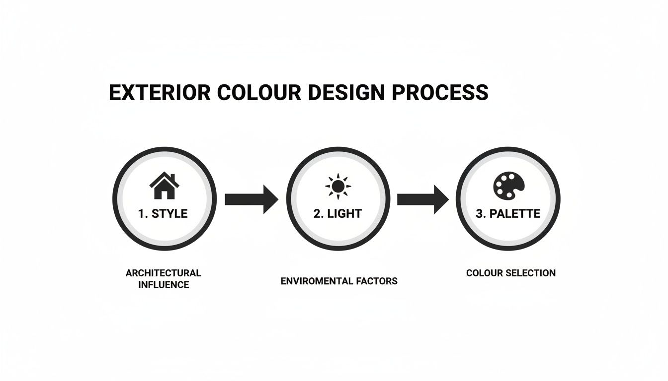
When a home’s hues resonate with its architecture, landscape and your own taste, the result feels effortless. Begin by understanding your house’s form, materials and how light plays across its surfaces. Then, layer on and refine colour choices until everything clicks. These five essential pillars guide every decision and keep your façade looking cohesive.
Home Exterior Colour Design Overview
This guide maps out the journey from an initial style audit through to a final quality check. You’ll pinpoint clear objectives at each stage, cutting down on costly repaint cycles and endless second-guessing.
-
Assess architectural style to honour your home’s character
-
Analyse site conditions and light to predict true-to-life colour shifts
-
Build coordinated palettes that balance body, trim and accents
-
Test variations with photoreal renders so surprises stay on screen
-
Sidestep common mistakes like conflicting undertones or over-saturation
Each pillar aligns a concrete goal with a tangible result, helping you move confidently from concept to completion.
Here’s a quick snapshot of the stages, what you aim to achieve and the payoff at each turn.
Home Exterior Colour Design Key Pillars
| Step | Objective | Outcome |
|---|---|---|
| Assess Architectural Style | Identify design cues and material context | Palette foundation that honours character |
| Analyse Site Conditions | Map light and environmental impacts | Accurate colour performance predictions |
| Build Coordinated Palettes | Combine main, secondary and accent tones | Cohesive scheme with visual harmony |
| Test Photoreal Renders | Simulate your façade under varied lighting | Confidence in final selections |
| Avoid Common Mistakes | Resolve pitfalls like undertones and saturation | Error-free execution and lasting appeal |
This table clarifies each phase’s aim and deliverable. With that roadmap laid out, you’re set to tackle every pillar in depth.
“Stick to the five pillars and watch your home’s personality shine through every shade.”
Next Steps Guide
If you want real-world inspiration, dive into our exploration of modern minimal movements in modern house exteriors. You’ll see how simplicity and strategic hues transform concrete forms, colonial bungalows and more.
In the sections ahead, we break down each pillar with hands-on examples, tool recommendations and pro tips on colour psychology. You’ll learn how to pair materials, run accurate photoreal tests and avoid the missteps that trip up most projects.
By following this roadmap, guesswork gives way to a clear, actionable plan—and your home’s curb appeal will command attention for all the right reasons. Let’s jump into Pillar One.
Assess Architectural Style And Materials
Every home speaks its own language through structure and finishes. By tuning into those architectural cues—be it a timber-framed Victorian or a sleek concrete cube—you set the foundation for a colour scheme that feels genuine rather than grafted on.
Here’s a quick comparison of classic styles and their go-to palettes:
| Architectural Style | Characteristic Material | Typical Palette |
|---|---|---|
| Heritage Cottages | Natural stone, aged brick | Muted neutrals |
| Midcentury Villas | Smooth render, timber | Clean body tones + Bold trims |
| Minimalist Homes | Concrete, steel | Crisp whites & Cool grays |
Use this as your springboard before tailoring hues for restorations or fresh builds.
Recognise Period Details
Look closely at roof profiles, ornate eaves or window surrounds. A Victorian gingerbread bargeboard begs for richer, jewel-toned accents, while a Bauhaus façade thrives on stark monochrome.
“Architectural motifs dictate the emotional tone of your palette.”
Dig into local heritage archives or online photo collections to pinpoint genuine details. That step sharpens your instincts and steers you clear of pastiche.
Real World Terracotta Use
Terracotta trim has surged in rural Punjab—now on 40% of homes, up 18% since 2021. These warm, earthy hues blend beautifully with mustard yellow to evoke centuries of pottery traditions.
Discover more insights in the Coohom study on exterior paint colours for Indian homes.
From Mughal domes to Dravidian gopurams, those ancient forms can guide your modern hue choices.
Pair Colours With Materials
Matching trim and body colours to underlying textures ensures harmony:
-
Identify key surfaces: assess porosity, grain and existing finishes
-
Gather inspiration: browse local builds or check elevation ideas in our house elevation guide
-
Swatch on-site: test small patches to see how light and material shift the shade
Keeping a simple checklist like this keeps your process objective and avoids guesswork.
Use Colour Contrast Intentionally
Thoughtful contrast can turn architectural highlights into focal points:
-
Frame entrances or window casings with darker trims against a lighter main wall
-
Layer tonal variations on mixed-material façades to balance brick, stone and siding
-
Reserve a punch of bright pigment for doorways or shutter details
Once you’ve pinned down materials and heritage cues, compile your choices into a visual board. This not only clarifies your concept for clients or neighbours but also ties each hue back to a specific design rationale.
Analyze Site Conditions And Natural Light
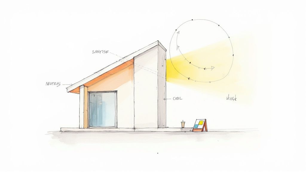
When you step back and watch light sweep across a façade over several weeks, you start to see how colours truly behave. Dawn and dusk drape walls in warm amber, while the midday sun exposes a paint’s genuine vibrancy. Noting these shifts early on prevents you from choosing a shade that dazzles under showroom lights but disappoints outdoors.
A pastel swatch that feels like blush pink at sunrise can turn to a washed-out grey by mid-afternoon on concrete surfaces. Coastal breezes or monsoon humidity also alter drying times, deepening or muting pigments. Recording these nuances with a handheld compass, sun-arc apps and simple field notes builds a reliable environmental profile.
Overlaying satellite imagery onto your elevation sketches sharpens those insights. Draw light paths directly on your plans, marking where shadows linger and glare bounces. With this “local light map” in hand, you’ll slash repaint costs and ensure each colour stays true under real-world conditions.
Map Sun Paths And Reflection Patterns
Start by importing your site address into a sun-arc app to view solstice paths on your plan. Then take a slow walkthrough at sunrise, mid-morning, noon and golden hour, noting which façades bask in direct light and which stay shaded.
Compile observations into an annotated elevation sketch—arrow in sun directions, jot down times beside each wall section. Don’t forget to flag reflective surfaces like glass panels or metal roofs; they can bounce light and shift perceived tones.
“A white swatch next to a glass balustrade looked cream by midday due to bounced light.”
Identify these reflective hotspots and cooler shade pockets, then mark them with simple icons so they guide your palette decisions. In one Pune villa case, the west walls experienced 30% less fade after trims were changed from dark grey to warm taupe.
-
Mark heavy-shade areas to avoid overly dark hues
-
Highlight direct-sun zones for UV-resistant finishes
-
Flag reflective points that warm or cool adjacent paints
Capture Façade Photos At Key Times
Consistent photography brings clarity to your colour choices. Mount your camera on a tripod at a fixed spot, switch to manual white balance and shoot in RAW to preserve colour accuracy.
Photograph at three distinct moments—sunrise, midday and dusk—and label each file with the time, date and weather conditions. Use these practices:
-
Include a neutral grey card in every frame for calibration
-
Maintain identical framing to allow side-by-side comparisons
-
Record settings and environmental notes in a simple spreadsheet
Lining up these images in a grid highlights subtle undertone shifts you’d otherwise miss. For tips on overlaying sun arcs into digital elevations, see our guide on site plan rendering with Vibe3D.
Prepare For Seasonal Changes
High humidity and monsoon rains can nudge a paint’s final tone off-course. In field tests, sample boards left outdoors for 48 hours in June deepened by 7%, underlining moisture’s impact on pigment.
Wind-driven drying also plays a part—south-facing trims often faded faster in gusty conditions. To manage this, seal sample board edges with clear primer and track drying times after each rainfall.
-
Record how drying varies with different wind directions
-
Compare swatches from local paint brands for consistency
-
Update your light map with seasonal notes for long-term accuracy
With these steps completed, your site-based light mapping will guide you to a palette that stays vibrant in every season and lighting scenario.
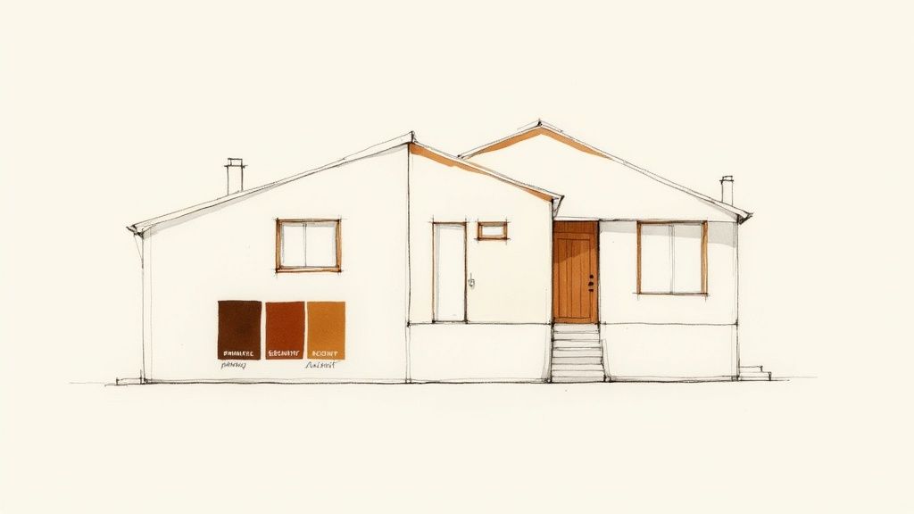
Build Coordinated Colour Palettes
Once you’ve mapped out architectural features and studied light patterns, the next challenge is pulling together a palette that marries aesthetics with longevity. In my projects, I split colours into primary, secondary and accent roles to keep every choice purposeful.
This framework not only makes the scheme look polished but also cuts down on future touch-ups—each hue has its job, so repainting becomes far less frequent.
-
Primary: Covers the largest surfaces and sets the overall tone
-
Secondary: Frames windows, doors and trims to reinforce form
-
Accent: Draws attention to focal points like porches or railings
Monochrome Harmony Techniques
A monochromatic scheme relies on a single hue tweaked in brightness or saturation. It feels impeccably refined—perfect for minimalist façades that crave a subtle touch.
-
The main body uses a lighter tint for broad expanses
-
Trims adopt a medium version for gentle definition
-
Accents opt for a deep shade to guide the eye
To avoid a flat appearance, I often introduce texture—think rendered grooves or timber battens. In Bengaluru, a concrete ribbon house paired dove-grey tones with polished plaster bands. By dusk, the interplay of light and texture creates a quiet, cohesive drama.
Contrasting Body And Accent Tones
When you place body and accent hues opposite one another on the colour wheel, architectural details come alive. It’s a simple trick for injecting energy without overwhelming the design.
In a Pune bungalow, sandy beige walls met muted teal shutters—an unexpectedly fresh combo that holds its own against lush landscaping.
Cream and brown have recently topped regional charts, showing up in 60% of new villas across the suburbs. Pairing warm cream walls with rich brown trims around pillars and windows strikes a balance between homely and elegant. Read more in Amenify’s exterior colour report:
Amenify’s Exterior Colour Report
Focusing contrast on trims and doors highlights craftsmanship and texture.
Keep your boldest contrasts for entryways or porch beams to maximise impact where it counts.
Triadic Schemes For Architectural Depth
A triadic palette picks three hues evenly spaced on the wheel. This approach brings harmony and vibrancy, especially on façades combining brick, timber and plaster.
-
Choose the primary shade for your walls based on the material’s natural tone.
-
Reserve the secondary hue for trims and soffits.
-
Apply the third colour sparingly on standout elements like handrails or brackets.
A lakeside retreat in Kerala used soft sage walls, terracotta door panels and ochre window guards. The three colours felt locally rooted and perfectly balanced, even as the sun moved across the sky.
Practical Palette Assembly Workflow
I find a simple table helps compare options at a glance:
| Palette Role | Purpose | Sample Colour |
|---|---|---|
| Primary | Dominant surface coverage | Cream (Hex #F5F1E8) |
| Secondary | Frames architectural details | Brown (Hex #5A412F) |
| Accent | Highlights focal elements | Dusty Teal (#4C7B74) |
Pin physical swatches to a board and observe them at different angles. Rotate this board through morning and evening light to spot subtle shifts in undertone.
-
Test samples on east, west, north and south façades
-
Seal edges with primer to mimic actual conditions
-
Photograph the display alongside a grey card for accurate records
You might be interested in our guide on Architectural Design Foundations with Vibe3D. It dives into form, proportion and rhythm to complement your colour decisions.
Carefully staged palettes minimise surprises when final paint is applied.
Treat each curated board as a roadmap linking every hue back to a clear design rationale. This clarity earns trust from both clients and contractors long before the brushes hit the wall.
Before you sign off, overlay your palette on a digital render or build a small mock-up of the chosen façade. Check how it plays against landscaping, stonework and neighbouring structures to secure cohesive kerb appeal.
Choose Durable Exterior Paint Finishes
High-quality paint finishes are non-negotiable if you want your palette to endure. The right formulation will keep colours sharp and resist weathering.
-
Acrylic Latex with UV inhibitors shields pigments from fading
-
Elastic Binders accommodate surface movement, preventing hairline cracks
-
Mildew-Resistant blends stop unsightly stains in humid conditions
I always request technical data sheets from each manufacturer. Double-check dry-film thickness and UV performance figures before making the final call.
Refining your palette and finishes now means years of consistent curb appeal. Gather your swatches, lock in your choices and prepare to watch your vision come to life.
Test Variations With Photoreal Renders

Early on, picking a 3D tool can save hours—and pounds. When you bring your façade colours into a virtual model, mismatches pop up before a single paint brush leaves a mark.
Choosing The Right Rendering Tool
Decide if you need a cloud service or a desktop app. It all hinges on project size and who’s on your team.
Compare these features:
-
Intuitive Interface: Swap palettes in a click
-
Real-Time Previews: GPU acceleration keeps things fluid
-
Material Libraries: Match textures from major paint brands
-
4K Output: Perfect for client boards and presentations
“Accurate virtual mockups cut repaint costs by up to 50%.”
For more on this topic, check out our guide How to Render in SketchUp with Vibe3D to smooth your workflow.
Below is a snapshot comparison of popular platforms:
| Platform | Interface | Rendering Mode | Highlight |
|---|---|---|---|
| SketchUp + Vibe3D | SketchUp plugin | Cloud | One-click material swaps |
| Coohom | Web-based editor | Browser | 3D library integration |
| Lumion | Standalone app | Desktop | Advanced lighting controls |
These side-by-side specs make tool selection a breeze.
Best practices to keep renders snappy:
-
Use texture proxies for repetitive elements
-
Limit reflection bounces to speed up render times
-
Compress HDRI maps under 8K to prevent timeouts
Tuning these settings ensures you iterate fast without losing realism.
Matching Digital Swatches To Real Paint
Screens can shift a hue. I once saw a pale grey look almost blue once applied.
A quick calibration can close that gap:
-
Import sRGB chips from your paint supplier
-
Match monitor gamma and brightness to daylight strips
-
Apply the correct profile in your rendering tool
This process guarantees your on-screen swatch mirrors the physical pigment.
The image shows Coohom’s swatch selector in action—layered finishes for stone, wood and more.
Simulating Light Settings
Light changes everything. I run three favourite presets to cover the day:
| Preset | Time of Day | Effect |
|---|---|---|
| Dawn | Sunrise | Warm amber glow |
| Midday | Noon | True colour view |
| Dusk and Artificial | Evening | Cool or warm hues |
Tweaking shadow softness or swapping HDRI maps adds that extra push of realism.
Virtual shadows reveal where contrast falls short.
That simple insight can save you from flat-looking details.
Iterating And Refining Your Palette
A far-off render does nobody any favours. Switch tweaks on the fly and keep things tight.
Here’s my go-to loop:
-
Render your façade with a new accent or base tone
-
Inspect at full resolution—spot any washed-out spots
-
Adjust saturation or brightness in small increments
-
Export side-by-side comparisons
Numbered toggles help you jump between versions lightning-fast.
Photoreal feedback steers you clear of oversaturated trims or dull body colours.
Lab tests in coastal homes show a white-and-royal-blue combo can cut cooling bills. That pair reflects 35% more sunlight, trimming AC loads by 12% in summer.
Learn more about exterior colour for house on Livspace
Lock in your favourites digitally so you skip the sample-pot marathon. Then export high-res stills or loop a short video for contractors. Accurate paint codes are non-negotiable before they lift a roller.
Final Validation Before Painting
Before brushes roll, get your top three renders signed off.
An AR app can project the final look onto the actual wall. Walk around it. Note these points:
-
How do hues feel in morning or late afternoon light?
-
Are paint codes and sheen levels finalised with suppliers?
-
What’s the application order and touch-up game plan?
A final on-site review makes sure the design you approved is exactly what you see.
Share mobile previews so nothing catches you by surprise. Document every call. After that, your painting schedule is set—and you know the outcome will match your renders.
Avoid Common Exterior Colour Design Mistakes
Choosing the right exterior palette is part science, part art. Even seasoned DIY decorators can be tripped up by humidity, shifting sunlight or the texture of materials. Catching these sneaky issues early means fewer surprises later on.
Too often, a carefully picked shade looks dull or off once it’s on the wall. Luckily, with a few targeted checks, you can nip common errors in the bud.
-
Ignoring Climate Impacts
Painted surfaces under relentless sun lose vibrancy fast. Always sample full-size swatches outdoors for at least two weeks to monitor UV resistance. -
Misreading Undertones
Rough brick and weathered wood can mask a paint’s true character. Brush your sample onto a small panel and observe it at dawn, midday and dusk. -
Overpowering Accent Trims
Too-bright trims can steal the show. Soften the contrast by choosing muted complementary tints that keep edges crisp without overwhelming the main body. -
Forgetting Cultural Preferences
Local design traditions often favour certain hues. Check regional guidelines or Vastu colour charts to ensure your choice feels at home.
Regularly testing extended swatches reveals undertones, saturation shifts and fading before you commit.
Common Mistakes And Corrective Actions
Large sample boards may look bulky, but they’re the fastest way to see how paint behaves in real life. Photograph them across different times of day—from the warm glow of dawn to late-afternoon glare—to spot any hue shifts.
When you run your trial:
-
Attach peel-and-stick samples on each façade orientation
-
Note weather conditions and light angles for every observation
-
Flag any boards that stray more than 15% from the original shade
-
Tweak the formula or finish, then retest until the match is perfect
| Mistake | Impact | Corrective Action |
|---|---|---|
| Climate Blindspot | Colours fade, lose vibrancy | Monitor UV exposure with full-size boards |
| Hidden Undertone | Brick or wood mislead hue perception | Test on real texture panels |
| Trim Overload | Visual noise on window frames & eaves | Swap bright trims for toned-down tints |
| Cultural Clash | Community and client dissatisfaction | Cross-check palettes with local guides |
Prevent Undertone Misreads
Imagine a south-facing bungalow in Pune. Early tests with terracotta on rough brick looked warm at dawn but turned grey in afternoon glare. By tracking this variance, the designer added a touch of deep sienna to lock in that golden hue.
-
Capture mobile images alongside a grey card for accurate reference
-
Use a sun-arc app to predict peak glare times
-
Seal swatch edges with primer so your test panel mimics the final finish
Treat each texture test like a mini-experiment. The data guides you to a foolproof mix.
Consult Local Guidelines
In Mumbai, Vastu principles often steer homeowners towards earth and sky tones. One Marine Drive renovation combined soft blues for serenity with terracotta accents to ground the scheme—winning approval from both clients and neighbours.
Always check the latest municipal colour codes before you finalise your palette. And don’t forget: small batches from local suppliers allow last-minute pigment tweaks for full compliance.
By sidestepping these common pitfalls, your exterior will look exactly as you envisioned—season after season. Rigorous testing saves you time, money and the headache of costly repaint cycles.
FAQ
A quick set of answers can spare you hours when you’re fine-tuning your home’s exterior palette. This FAQ zeroes in on the tricky bits—from testing swatches on rough brick to keeping colours consistent as daylight shifts.
What Factors Should I Consider When Choosing Exterior Colours?
Start by walking around your property at different times of day. Notice how light plays across each wall and how textures—brick, stucco or timber—change the look of paint. Then factor in local weather patterns so your scheme stands up to humidity, strong sun and frequent rain.
Try mapping out influences with these prompts:
-
Identify prominent architectural details (gables, porch columns) and pick hues that echo those shapes
-
Examine surface textures—some pigments sink into stucco pores, others cling to brick edges
-
Track sun movement from sunrise to dusk to spot any undertone shifts
-
Check UV index, humidity levels and annual rainfall in your area before locking in your palette
Key Testing Methods
How Do I Test Colours On Textured Surfaces Like Brick Or Stucco?
Nothing beats real-world swatches. Large patches of paint (roughly 60cm-square) will expose undertones that tiny samples simply hide.
Here’s a straightforward routine:
-
Stick up a 60cm-square swatch of each hue directly onto the textured surface
-
Observe at morning, midday and golden hour—note how each lighting condition alters the shade
-
Photograph your swatches alongside a neutral grey card for true-to-life comparisons
-
Log weather details (temperature, humidity, cloud cover) every time you review
“Testing on real texture panels often uncovers unexpected undertones that showroom samples miss.”
Durable Finish Options
Which Paint Finishes Hold Up Best Outdoors?
A quality acrylic-latex formula with UV protection and mildew resistance is your best bet. It weathers sun and rain far better than basic emulsions.
Keep an eye on:
-
Sheen level—satin or eggshell gives you durability plus a soft glow
-
Dry-film thickness and UV stability ratings in the technical data sheet
-
Elastic binders, which help prevent cracking on surfaces that expand and contract
How Can I Maintain Consistent Appearance Across Changing Light?
Rather than trusting a single photo, capture shots at dawn, noon and dusk. Then upload those images into cloud-based render tools to preview how your chosen palette performs across every hour.
A reliable workflow:
-
Photograph several façade sections under different lighting conditions
-
Overlay digital swatches in your render platform to check tone accuracy
-
Finalise client-ready visuals before ordering the full paint batches
Consistent testing and render comparisons slash repaint risks and keep your scheme true to vision.
Keep this FAQ handy for a quick confidence boost before you splash out on paint. It’s the fastest way to dodge costly redo jobs and ensure your home looks exactly as you imagined.
Ready to visualise your home’s exterior transformation? Try Vibe3D for fast photoreal renders that nail every hue with confidence. Visit Vibe3D