Elevation colour design is really the art of choosing the perfect palette of colours and materials for your home's exterior. It's about creating a look that’s both beautiful and completely cohesive. This isn't just about slapping on a coat of paint; it's a strategic approach to building a visual identity that boosts your home's appeal and highlights its unique architectural style.
Your Home’s First Impression Starts with Colour
Think of your home's exterior as its public face—the very first thing anyone sees. Whether it's a visitor, a neighbour, or a potential buyer, that initial glance creates a powerful and lasting impression. The colours and materials you choose tell a story about the home's style, how it fits into its surroundings, and even a little bit about you.
A well-thought-out colour scheme does more than just cover the walls; it crafts a complete visual identity. It's a process that goes far beyond picking a nice shade from a paint swatch. You have to balance what looks good with what will last, creating a finish that is as durable as it is beautiful. Knowing how to improve curb appeal and boost home value is key, as every exterior element, especially your colour palette, works together to make a stunning impression and increase your property's value.
More Than Just Aesthetics
A great elevation colour design delivers some serious benefits that go well beyond just looking good. It's a cornerstone of architectural design that influences how your home is perceived and how it performs.
-
Enhanced Kerb Appeal: The right colour scheme makes a home feel instantly welcoming and looked-after, which dramatically improves its presence from the street.
-
Increased Property Value: It's a fact—homes with professionally chosen exterior colours often sell for more. That strong first impression can easily translate into a higher offer.
-
Energy Efficiency: Colour choice can even impact your energy bills. Lighter colours, for example, reflect sunlight and can help keep a house cooler in a hot climate, which might mean less reliance on air conditioning.
-
Personal Expression: Your home’s exterior is a massive canvas for your personal style. Whether you're after a bold, contemporary statement or something more timeless and traditional, your colour choices are a powerful way to express yourself.
When you approach your home’s exterior with a clear strategy, you’re not just building a structure—you're making a statement. If you're looking for some inspiration, checking out different modern house elevation designs can be a great way to spark ideas for your own project.
Mastering the Fundamentals of Colour Harmony
Figuring out colour theory for a home's exterior can feel a bit daunting, but it’s actually more straightforward than you might think. The trick is to step away from guesswork and start thinking like a designer. By using a few proven frameworks, you can create a look that feels balanced, intentional, and genuinely harmonious.
One of the most reliable methods out there is the 60-30-10 rule. It’s a classic principle borrowed from interior design that translates beautifully to exteriors, giving you a simple recipe for distributing colour across your home’s facade.
Think of it like casting roles in a play: you have your main character, a supporting actor, and a cameo that steals the show. Your main colour sets the scene, the secondary colour adds depth, and the accent colour delivers that memorable finishing touch.
Applying the 60-30-10 Rule
This simple framework is all about allocating your colour palette to create a cohesive and professional look. It breaks down like this:
-
60% Dominant Colour: This is your primary shade, the one that will cover the largest surface areas like the main walls. It sets the overall mood and acts as the canvas for everything else.
-
30% Secondary Colour: This colour is there to support the dominant shade. It should complement it, not compete with it. You'll typically see it on trim, gables, or maybe a feature wall to add visual interest.
-
10% Accent Colour: Here’s where you can get a little bold. This pop of colour is used sparingly on smaller elements like the front door, shutters, or window frames. It's designed to catch the eye and inject a dose of personality.
To help you visualise this, here’s a breakdown of how the 60-30-10 rule applies to a home's exterior.
The 60-30-10 Rule for Exterior Elevations
| Percentage | Role | Typical Application Areas | Example Colour Scheme |
|---|---|---|---|
| 60% | Dominant | Main siding, brick, stucco, or primary wall surfaces. | Greige |
| 30% | Secondary | Roof, garage doors, fascia, soffits, major trim. | Crisp White |
| 10% | Accent | Front door, shutters, window frames, railings, light fixtures. | Deep Navy Blue |
Following this simple ratio helps ensure your final design feels balanced and thoughtfully composed, rather than chaotic or accidental.
This diagram shows just how much your design choices can impact the overall impression of your home, touching everything from its curb appeal to its market value and unique identity.
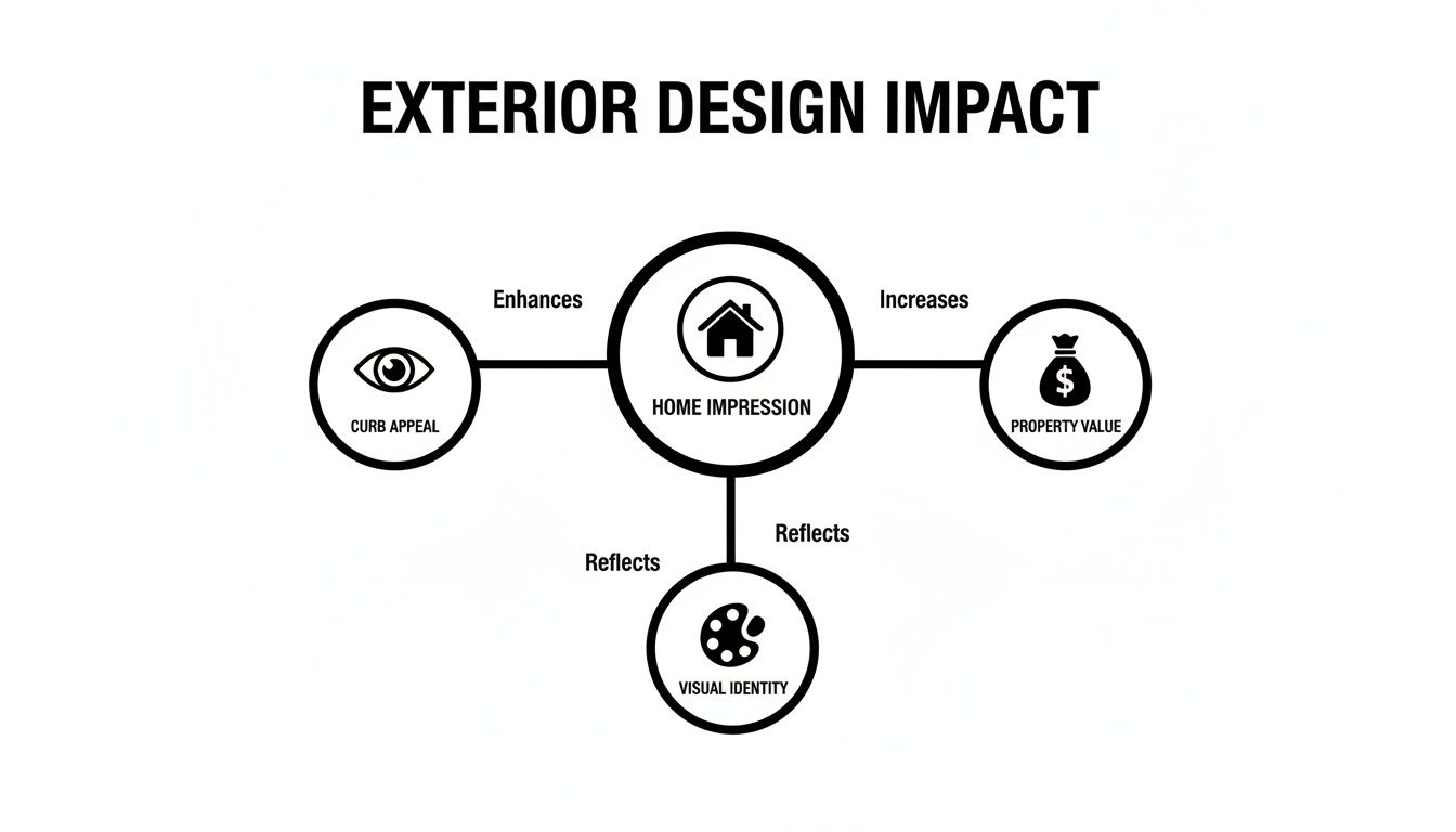
As you can see, a home's visual identity isn't just about aesthetics; it's directly tied to tangible outcomes like property value. This makes strategic colour choices a genuinely worthwhile investment.
Understanding Colour Psychology in Architecture
Colour does so much more than just decorate; it makes us feel things. In architecture, colour psychology is a powerful tool for creating a specific mood before anyone even sets foot inside. Warm, earthy tones like terracotta, beige, and muted yellows can make a large, imposing house feel welcoming and grounded.
On the other hand, cool neutrals like grey, off-white, and charcoal often create a sense of clean, modern sophistication. When you understand these associations, you can craft a home that doesn’t just look great but feels right. If you’re leaning towards a contemporary look, our guide on the modern house exterior has plenty of inspiration to get you started.
Your home’s exterior is a public statement. A well-chosen colour palette communicates a story of quality and care, turning a simple structure into a landmark of personal style and thoughtful design.
Even a simplified colour wheel can be your best friend here. Monochromatic schemes, which use different shades of a single colour, create a subtle, elegant look. For something a bit more dynamic but still serene, analogous schemes use colours that sit next to each other on the wheel. And if you're after a bold, high-contrast result, complementary schemes use colours from opposite sides of the wheel.
A great way to see how these principles work in the real world is to look at curated examples. Exploring some of the top exterior paint color combinations can really help you understand how theory is put into practice. It’s a hands-on way to build your confidence and move beyond basic beige.
How Your Climate Shapes Your Colour Choices
Choosing an exterior colour is much more than just picking a shade you like. It's a practical conversation with your environment. A stunning elevation design that ignores the local climate is like wearing a wool coat to the beach—it just doesn't make sense. The sun, rain, and temperature where you live will directly affect how colours appear, how long they last, and even how comfortable your home feels inside.
Think of your home's exterior as its skin. Just as our skin has to cope with different weather, your home's facade needs to be ready for the specific challenges of its surroundings. A colour that looks perfect in a catalogue might fade to nothing under intense sun or become a breeding ground for mould in a damp climate.
That’s why a successful design works with nature, not against it. By thinking about climate from the very beginning, you can select a palette that isn't just beautiful, but also durable, low-maintenance, and even energy-efficient. This smart approach ensures your home looks great and functions perfectly for years.
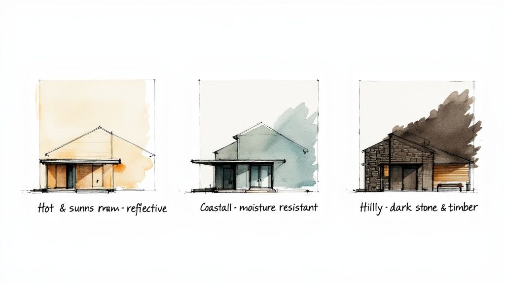
Hot and Arid Climates
In sun-drenched regions like Rajasthan or Gujarat, the sun is a relentless force. Dark colours are heat magnets, absorbing sunlight and cranking up a home's internal temperature, which sends your cooling bills through the roof. It’s no surprise that traditional architecture in these areas almost always features light, reflective colours.
Lighter shades—think whites, creams, beiges, and soft pastels—act like a mirror, bouncing the sun's harsh rays away from the building. This simple, ancient trick can lower surface temperatures, making the home naturally cooler and more energy-efficient.
An elevation colour design for a hot climate is a masterclass in functional beauty. By choosing light, reflective colours, you are not just making an aesthetic choice—you are implementing a passive cooling strategy that lowers energy bills and enhances indoor comfort.
It's not just about the paint, though. Materials and finishes play a big part. Smooth surfaces are less likely to trap the dust and sand that are always in the air in arid environments, which helps the exterior stay looking clean and fresh.
Coastal and Humid Regions
Homes in coastal areas like Kerala or Goa face a completely different enemy: moisture. Between the high humidity and heavy monsoon rains, the main worry is the damage caused by water. This can lead to algae, mould, and peeling paint if you don't plan for it. The right elevation colour design becomes your first line of defence.
For these environments, you'll want colours and finishes that are specifically made with anti-fungal and moisture-resistant properties. High-quality acrylic paints are often a fantastic choice because they create a protective barrier that repels water. Lighter colours are again a good bet, as they do a better job of hiding water stains and don't fade as noticeably under the strong coastal sun.
Hilly and Cold Terrains
Up in the colder, hilly regions of Himachal Pradesh or Uttarakhand, homes need to be tough. They have to withstand snow, frost, and wild temperature swings. Here, the design choices are all about durability and retaining heat. Darker colours, like deep greys, rich browns, and earthy tones, can be a real strategic advantage.
These darker shades absorb sunlight and help hold onto warmth, which contributes to passive heating during the long, cold winters. You’ll also see a lot of natural materials like local stone and timber. They’re not just popular for their rustic beauty; they're incredibly resilient, stand up to harsh weather, and blend seamlessly into the mountain landscape.
Across India, these regional preferences aren't just about tradition—they're based on smart climatic and cultural reasoning. For instance, over 60% of contemporary projects now favour a neutral base colour complemented by natural stone or wood. This trend perfectly balances a modern look with the need for regional performance. You can explore more of these fascinating architectural elevation styles across India to see how they adapt to their local conditions.
Choosing Exterior Finishes for Lasting Beauty
The real cost of an exterior finish isn’t what you see on the price tag. When you're thinking about elevation colour design, the smart money is on materials that look good not just today, but for years to come. Investing in quality from the get-go is one of the best decisions you can make—it saves you a world of time, money, and hassle down the road.
Think of your exterior paint as a protective shield, not just a pretty colour. Premium paints are packed with better pigments and binders, giving them serious muscle against sun and rain. This means less fading, less chipping, and a home that doesn't look worn out after a few monsoons.
Sure, a cheaper can of paint saves you a bit of cash upfront. But you'll likely be back up on that ladder, repainting, in just a few years. A high-performance paint system, on the other hand, stretches that timeline out, keeping your home looking sharp and well-protected for much, much longer.
Performance Beyond the Surface
Modern exterior finishes are workhorses. They do more than just add colour; they can actually solve problems and make your home a more comfortable place to live.
For a climate like India's, heat-reflective paint is a game-changer. These aren't just ordinary paints; they're loaded with special pigments that literally bounce the sun's infrared light away from your walls. This keeps the surface cooler, meaning less heat gets inside your home. The result? A more comfortable interior and potentially lower electricity bills from running the AC.
The right finish acts as a silent partner in your home's performance. It’s a functional choice that works around the clock to protect your structure, manage heat, and maintain its aesthetic appeal with minimal intervention.
It's a perfect example of how an effective architecture elevation design marries good looks with practical engineering.
The Smart Role of Texture and Sheen
The final touch—the sheen of your paint—also has a big impact on maintenance. A flat, matte finish is brilliant at hiding minor imperfections. Think small cracks or slightly uneven plaster. Because it doesn't reflect light, it smooths over these little flaws, making them nearly invisible.
Textured finishes or materials like stone cladding are another clever trick. They create a visually rich surface where a bit of dust or slight weathering just blends into the background, helping your home look freshly finished for longer.
The numbers back this up. Experts in India suggest that using better-quality exterior paints can push the time between repainting from a typical 3–5 years to as long as 7–10 years. On top of that, choosing lighter, heat-reflective colours can drop surface temperatures by 3–5°C, easing the cooling load on your home in peak summer. To see more on this, you can check out how these trends in elevation design are shaping homes.
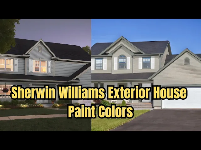
Using Digital Tools to Preview Your Perfect Home
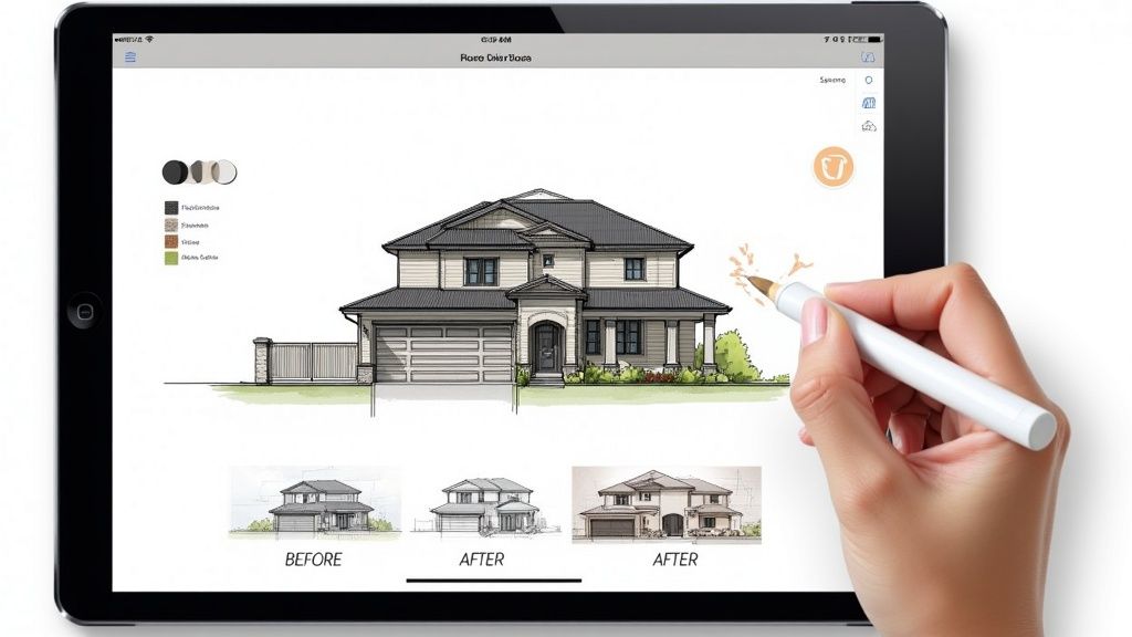
What if you could see exactly what your home's exterior will look like before a single brick is laid or a drop of paint is bought? That's no longer a far-off dream. Thanks to 3D elevation visualisation, it's now a crucial part of the design process. Think of these digital mockups as your 'try before you buy' pass, letting you play with endless combinations of colours, materials, and textures without any of the cost or commitment.
This technology completely takes the guesswork out of exterior design. Gone are the days of holding up tiny paint swatches and just hoping for the best. Now, you can see precisely how that bold accent colour plays off your stone cladding, or how a particular shade of white changes from the bright morning sun to the soft evening light.
Build Confidence and Sidestep Costly Errors
The real magic of digital visualisation lies in its power to help you avoid expensive mistakes. We've all heard stories of someone hating a colour once it's up on the wall—a frustrating and costly fix. A 3D model lets you fine-tune every detail of your elevation colour design on a screen, making sure what you see is what you'll get.
This digital dress rehearsal gives you a serious upper hand:
-
Experiment Without Limits: Swap out dozens of palettes and material combinations in a matter of minutes.
-
Decide with Certainty: Seeing a realistic preview of your final choices gives you the confidence to sign off on them.
-
Budget Smarter: 3D models are brilliant for accurately calculating how much material you'll need, which means less waste and a tighter budget.
This approach is catching on fast across India, with more and more homeowners insisting on finalising their exterior look with digital tools before the physical work starts. It’s no surprise that demand for 3D front-elevation services has jumped, with packages ranging from ₹2,499 to ₹9,999 becoming commonplace in cities like Delhi, Mumbai, and Bengaluru. Going digital-first simply cuts down on expensive rework and helps you get a much clearer cost estimate for your exterior finishes. You can find out more about how homeowners are using 3D tools to explore the latest design trends on HouseGyan.com.
Bringing Pro-Level Tools to Everyone
Not long ago, creating these stunningly realistic visuals was a job left to professionals with complex, expensive software. Today, the game has changed. The tools are more intuitive and accessible than ever, putting incredible design power into the hands of homeowners and designers. There's a whole world of powerful, user-friendly architectural rendering software out there ready to bring your ideas to life.
By embracing 3D visualisation, you transform the design process from a gamble into a predictable journey. It is the most effective way to guarantee that the home you have in your mind is the one that gets built.
Ultimately, this technology demystifies the entire design journey. It's an indispensable resource for anyone who wants to create a truly flawless home exterior.
Your Step-by-Step Plan for a Flawless Exterior
Taking your ideas for a great elevation colour design from a concept to a finished project needs a clear, structured plan. This guide breaks down the whole process, turning what can feel like a massive task into a manageable and even creative journey.
Think of it as your roadmap. Each stage builds on the one before it, making sure every decision is thoughtful, cohesive, and perfectly suited to your home and its surroundings. By following these steps, you can move forward with confidence.
Stage 1: Gather Inspiration and Analyse Your Home
The first step is all about looking around you. Start by creating a mood board. Collect images of homes you love and pay close attention to their colour combinations and the materials they use. Notice how different styles work with their environment and architectural details.
Next, take a good, hard look at your own home’s fixed elements. What colour is the roof? What about the finish on your window frames? Do you have any existing stone or brick features? These are the parts of your palette you can't change, so any new colours have to work with them.
Stage 2: Develop Your Colour Palette
Once you've got your inspiration and a solid analysis of your home, it’s time to build your colour scheme. A great tool for this is the 60-30-10 rule, which helps create a balanced and professional-looking result.
-
Select Your Dominant Colour (60%): This is the main colour for your walls. It sets the overall tone and needs to harmonise with both the fixed elements of your house and the local climate.
-
Choose a Secondary Colour (30%): This shade is there to support the dominant colour. You'll use it on features like trim, gables, or the garage door to add some depth and visual interest.
-
Pick an Accent Colour (10%): This is where you can inject a bit of personality! Use a bolder or contrasting shade for the front door, shutters, or other small details to create a pop of colour and a clear focal point.
Stage 3: Visualise and Finalise Your Design
Before you commit to buying litres of paint and hiring labour, you absolutely have to see how your choices look in the real world. A great way to start is by painting large sample swatches on different sides of your house. This lets you see how the colours react to sunlight and shade at various times of the day.
The final and most crucial step is to bring your vision to life digitally. This takes all the guesswork out of the equation and helps you avoid expensive mistakes, ensuring the finished home looks exactly as you imagined.
Using digital tools is really the best way to get a complete preview. For a crystal-clear and realistic picture of the final outcome, you can explore the benefits of a 3-D rendering for your house exterior. This technology allows you to experiment with different combinations and lock in your elevation colour design with total confidence.
Frequently Asked Questions About Elevation Colour
Getting into the nitty-gritty of elevation colour can spark a lot of questions. It's perfectly normal. To help you navigate the process, I’ve put together answers to some of the most common queries I hear, giving you practical advice for your home's exterior.
What Are the Most Popular Elevation Colour Combinations?
Right now, there's a real shift towards palettes that feel sophisticated but also grounded and natural. Many homeowners are leaning into neutral bases for their main walls—think soft greys, crisp whites, and inviting warm beiges. These colours are timeless and create a clean, modern canvas.
But it’s the pairing that really brings it to life. We’re seeing these neutral foundations beautifully complemented by natural materials. Imagine the warmth of rich timber cladding or the rugged texture of stonework on a feature wall. This mix of smooth painted surfaces and organic elements creates a facade that’s balanced, interesting, and feels connected to the landscape. Of course, timeless regional palettes that reflect local materials never go out of style either.
How Do I Choose a Colour That Will Not Look Dated?
The real secret to a timeless look is to work with the elements you can't easily change. Your home already has fixed features—the colour of your roof tiles, the tone of your window frames, or any existing brickwork. A great colour scheme doesn't fight these things; it harmonises with them.
To avoid a look that feels old in just a few years, anchor your palette in classic, nature-inspired colours. Earthy tones, soft neutrals, and deep, muted shades have a lasting appeal that trendy, bright colours just can't match.
Think about how your chosen colours fit within the broader context of your garden and even your neighbourhood. A scheme that feels like it belongs in its environment will always look more deliberate and less like a passing fad. The aim is to create an exterior that looks classic from the moment it's finished and for many years after.
How Many Exterior Colours Are Too Many?
It’s easy to get carried away and want to use different colours to highlight every architectural detail, but honestly, less is usually more. Piling on too many shades can make a house look chaotic and fragmented, rather than well-designed.
A great rule of thumb is the 60-30-10 rule, which naturally guides you to about three colours. In most situations, a palette of three to four carefully chosen colours is the sweet spot. This is just enough to create depth and highlight key features without visually overwhelming the design.
Typically, this breaks down as:
-
A dominant colour for the main body of the house.
-
A secondary shade for the trim and gables.
-
An accent colour for a pop on the front door or shutters.
-
A fourth colour might come into play if you have a significant natural material, like stone or wood, that acts as its own shade.
Ready to see how your elevation colour ideas would look in reality before you pick up a paintbrush? Vibe3D uses AI to transform your models into stunning, photorealistic visuals in seconds. It’s the perfect way to avoid costly mistakes and feel confident in your final vision. Explore how it works at https://vibe3d.ai.