At its heart, Rhino rendering is about breathing life into your 3D models. It’s the craft of taking a digital file from Rhinoceros 3D and transforming it into a photorealistic image that looks like it was captured with a camera, not created on a computer. For anyone in product design, architecture, or jewellery, mastering this is non-negotiable for presenting ideas with impact.
Building the Foundation for Flawless Renders
Let's get one thing straight: before you even touch a render setting, the quality of your Rhino model itself will dictate 90% of your final image's success. I’ve seen countless projects stumble here. A messy, unprepared model is a one-way ticket to slow render times, bizarre visual glitches, and a whole lot of frustration.
Think of it like building a house—a shaky foundation will compromise everything you build on top of it. Your first move should always be a thorough geometry cleanup. Run the ShowNakedEdges command and fix any unjoined surfaces. Make sure everything that’s supposed to be a solid object is a "closed polysurface." This simple discipline prevents light leaks and strange artefacts that can completely derail an otherwise perfect shot.
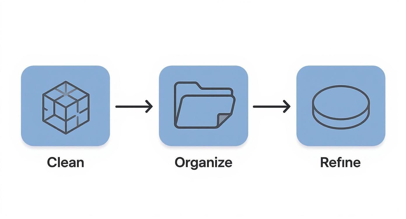
Organise Your Scene with Layers
A well-organised layer system is your best friend, especially in complex projects. Please, don't just dump everything onto the default layers. Build a logical structure from the start—it will save you hours down the line.
Here’s how I typically break it down:
-
By Material: This is the most effective method for rendering. Create layers like "Glass Panels," "Steel Frame," or "Oak Flooring." When it comes time to apply materials, you can do it in seconds instead of picking hundreds of individual objects.
-
By Object Type: It’s also helpful to group elements like "Windows," "Furniture," or "Fasteners." This makes it easy to isolate specific parts of the scene for a quick test render or just to speed up your viewport navigation.
-
By Location: For architectural work, layers like "First Floor Walls" or "Exterior Landscaping" are essential for keeping the project from becoming an unmanageable beast.
This isn't just about being tidy. A clean layer structure is fundamental to an efficient workflow. Refining your model is just as important as the initial creation. I always add subtle fillets to sharp edges. Why? Because perfectly sharp corners don't exist in the real world, and those tiny rounded edges catch highlights beautifully, adding a layer of believability that's otherwise impossible to achieve. For a broader view of the tools out there, our guide on top architectural rendering software provides some great context.
Your Rhino Scene Optimization Checklist
To keep things simple, I’ve put together a quick checklist that covers the core principles of prepping your Rhino file. Think of this as your pre-flight check before launching the render.
| Action Item | Impact on Your Render | Pro Tip |
|---|---|---|
| Close All Polysurfaces | Prevents light leaks and render errors. | Use the ShowNakedEdges command to quickly find and fix problem areas. |
| Organise Objects on Layers | Speeds up material assignment and workflow. | Create parent layers for major categories (e.g., "Architecture") with sub-layers for materials (e.g., "Glass," "Concrete"). |
| Apply Small Fillets to Edges | Catches highlights realistically, adds believability. | Even a tiny 0.5mm fillet can make a huge difference. Use the FilletEdge command. |
| Purge Unused Elements | Reduces file size and speeds up loading times. | Run the Purge command to remove unused block definitions, layers, and materials before you start. |
| Set Correct Model Units | Ensures textures and lighting scale properly. | Check your units (Options > Units) before importing any assets. Mismatched scales are a common headache. |
Following these steps might seem like extra work upfront, but trust me, it’s the secret to a smooth, professional-grade rendering process. It turns a potentially chaotic task into a structured and predictable workflow.
A critical pro tip: Never use pure black or pure white materials. In the real world, no surface is 100% reflective or absorbent. Using a dark grey (like RGB 10, 10, 10) instead of pure black will make your shadows and materials look far more natural. The same goes for white—try something like RGB 245, 245, 245.
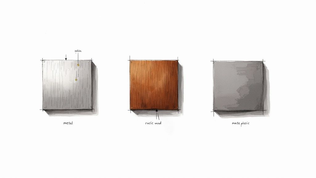
Crafting Believable Materials and Textures
This is where the magic happens. Materials are what breathe life into your models, transforming them from digital geometry into something that feels tangible. A perfect model can fall flat if it’s covered in a surface that just looks… fake. Getting materials right isn’t about presets; it’s about learning to see how light interacts with surfaces in the real world and then recreating that dance in Rhino.
Your journey into materials starts by looking beyond the simple diffuse colour. In a modern engine like Cycles or V-Ray, the real character of a surface is defined by how it plays with light.
Take reflections, for instance. Are they crisp and perfect like polished chrome, or are they soft and diffuse like brushed aluminium? This single attribute, controlled by a roughness or glossiness slider, can make the difference between a material feeling like cheap plastic or high-end metal. A tiny tweak here changes everything.
Getting It Right with PBR Workflows
If you want consistent, realistic results, you need to be using a Physically Based Rendering (PBR) workflow. PBR is the industry standard for a reason. Its materials are built to model the flow of light accurately, which means they look correct under almost any lighting setup. This is a huge time-saver and a massive step up for your rhino rendering quality.
A standard PBR material isn't just one texture but a collection of maps that work together:
-
Albedo/Diffuse: The pure, flat colour of the surface, with no lighting or shadows baked in.
-
Roughness: A greyscale map that controls reflections. Black is a perfect mirror; white is completely matte. The shades in between create all the nuance.
-
Normal/Bump Map: This is the secret weapon. It fakes fine surface details like the pores in leather or the grain in wood without adding a single polygon to your model. It adds that tactile feel.
-
Metalness: A simple black-and-white map that tells the renderer whether a surface is a metal or a non-metal (a dielectric). It’s a fundamental switch in how light is calculated.
Finding high-quality texture maps from dedicated libraries is a total game-changer. Once you have them, the next challenge is applying them correctly. While Rhino has several mapping options, Box Mapping will become your best friend for complex shapes. It's fantastic at preventing the stretched, warped textures you often get with simpler mapping techniques.
A Quick Example: Brushed Metal
Let’s imagine we’re creating a simple brushed metal material. You’d start by setting a dark grey Albedo colour and cranking the Metalness value to 100%.
The most crucial map here is the roughness map. Instead of a flat grey value, you'd plug in a texture with fine, linear streaks. This tells the render engine to blur the reflections and stretch them slightly along the direction of the brush marks. To sell the effect, you can use that same streaky texture (or a version of it) as a subtle bump map. Instantly, your flat plane has a sense of direction and a manufactured quality.
Key Takeaway: Realism lives in the imperfections. Nothing in the real world is perfectly clean or uniform. Use your roughness maps to add subtle smudges, fingerprints, and tiny scratches. These details break up the unnaturally perfect reflections that scream "computer-generated".
Seeing how these principles are applied in different contexts can be incredibly helpful. For designers working on architectural or product scenes, many of the material techniques used for high-end rhino rendering are universal. You can see similar workflows in guides for creating compelling 3ds Max interior design visuals, for example. Broadening your knowledge across different software builds a much stronger foundation.
The Art of Realistic Digital Lighting
Even the most perfect materials will fall flat under bad lighting. Truthfully, light is the single most important tool you have for a great rhino rendering. It’s what carves out form, sets the mood, and guides the viewer's eye. Getting good at it is less about memorising settings and more about developing an eye for how light behaves in the real world.
For exterior scenes, your first port of call is usually Rhino’s built-in sun and sky system. It’s a brilliant, physically accurate simulation that generates realistic daylight based on the time, date, and location you set. Just by sliding the time of day, you can completely change a scene's atmosphere—from the crisp, cool shadows of high noon to the warm, long light of a golden hour sunset. Never underestimate the emotion you can pack into a render with this one tool.
Mastering Interior and Studio Setups
When you move indoors or start shooting products, you'll be leaning on artificial lights. Most render engines give you a few core types to work with, and each has a job to do. An Area Light, for instance, is perfect for faking the soft, diffused light coming through a window or from a big studio softbox. A Spotlight is much more focused, letting you create dramatic highlights on a specific feature.
One of the most classic and effective techniques, especially for product renders, is the three-point lighting setup. It’s a deceptively simple arrangement that gives you an incredible amount of control and consistently professional results.
-
Key Light: Think of this as your main light source. It's the brightest and is usually placed off to one side of the camera. It does the heavy lifting, defining the object's form and casting the most prominent shadows.
-
Fill Light: Placed on the opposite side, the fill light is softer and dimmer. Its only job is to "fill in" the harsh shadows from the key light, letting you see details in the darker areas without washing everything out.
-
Rim Light (or Backlight): This one goes behind your subject. It creates a subtle, bright outline around the edges, which is the secret sauce for making your object pop from the background. It adds that crisp definition that screams "professional."
This image from Chaos demonstrates a lighting setup that accentuates material properties on various objects.
You can see how the highlights and reflections perfectly trace the form and texture of each sphere—that’s a direct result of placing lights with intention.
The Power of HDRI Lighting
Looking for a shortcut to photorealistic environmental light? Start using a High Dynamic Range Image (HDRI). An HDRI is a special 360-degree photo that contains a massive amount of real-world light data. When you load one into your scene's environment, it projects all that complex light and colour onto your model. The result is instant, hyper-realistic lighting and reflections that are almost impossible to create manually. It's a total game-changer.
The success story of the greater one-horned rhino in India is a powerful parallel to the idea of a healthy, thriving environment. From a population of fewer than 200 individuals in 1900, dedicated conservation efforts have helped them rebound to over 4,000 today. It’s a fantastic reminder of how the right environment can foster incredible growth.
Pro Tip: Balance is everything. Try to avoid making every light in your scene the same intensity or colour. Establish a dominant light source to set the primary mood, then use secondary lights to gently bring out details and add depth. The magic is always in the interplay between light and shadow.
These lighting principles are completely transferable skills. The buttons might be in different places, but the core concepts of shaping form with light are the same everywhere. Many designers apply the exact same thinking when they learn how to render in SketchUp or other 3D software.
Setting Your Camera for the Perfect Shot
You can create a technically perfect render, but if the composition is off, the whole thing falls flat. The best rendering artists I know think more like photographers. They don't just point and click; they meticulously frame their scenes to guide the viewer’s eye and tell a compelling story. It's about composing a digital shot with real intention.
If you're just starting out, classic principles like the rule of thirds are a lifesaver. Just imagine your viewport is split into a 3x3 grid, and position your main subject where those lines intersect. This one small change instantly creates a more dynamic and interesting image than just sticking your object dead-centre. Also, keep an eye out for leading lines—things like countertop edges, floorboards, or curved walls that naturally draw your eye through the scene to the focal point.
Fine-Tuning Your Digital Lens
Think of your camera's focal length as another powerful creative tool. A wide-angle lens, maybe around 24mm, can make an interior space feel absolutely huge and dramatic. The trade-off is that it can distort objects near the edges, which isn't always what you want.
For more natural-looking product shots or architectural visualisations, I almost always stick to a focal length between 35mm and 50mm. This range closely mimics how we see the world, giving the final image a more grounded, realistic feel.
To get that beautiful, cinematic focus on your subject, start playing with Depth of Field (DoF). This is what blurs the foreground and background, pulling sharp focus onto one specific part of your model. It’s a fantastic trick for adding a layer of professional polish and telling the viewer exactly where to look. A word of caution, though: don't overdo it. An extremely shallow DoF can make your scene look like a tiny miniature model, which might not be the effect you're going for.
Compositional Takeaway: A simple trick I love is to frame your subject, then add a foreground element that's slightly out of focus. It adds an incredible sense of depth and makes the viewer feel like they are right there in the scene, looking past an object to the main event.
Balancing Quality and Speed in Your Render Settings
Once you've got the shot perfectly composed, it’s time to dive into the render settings. This is always a balancing act between getting a beautiful, clean image and not waiting forever for it to finish. Your two main levers here are resolution and sampling.
-
Resolution: This is simply the final image size in pixels (e.g., 1920x1080 for a standard HD image). Higher resolutions mean more detail, but they also mean longer render times. My workflow always involves doing quick, low-resolution test renders to check lighting and materials before committing to the final high-res version.
-
Sampling/Noise Threshold: This setting tells the render engine how much effort to put into cleaning up that grainy "noise" you see in early renders. Higher sample counts or lower noise thresholds give you a much cleaner image, but they can dramatically increase how long you have to wait.
Achieving the right balance is key to getting powerful results—a principle that applies far beyond rendering. Look at conservation, for instance. India is now ranked second globally in rhino population, home to between 3,200 and 3,700 greater one-horned rhinos. This incredible success comes from a balanced approach of strong anti-poaching laws and careful habitat restoration. It’s a great real-world example of how dialling in the right settings yields success. You can read more about India's rhino population on Jagran Josh.
These core ideas of composition and camera work are universal across the entire visualisation industry. Understanding how the pros frame architectural scenes can give you a ton of inspiration for your own Rhino projects.
Adding the Final Polish in Post-Production
Think of the raw output from your render engine as a starting point. The absolute best visuals are almost never straight out of Rhino; they’re carefully refined in post-production. This final 10% of the work is where a good image becomes a great one, allowing you to inject your personal style and make your design truly stand out.
This is where tools like Adobe Photoshop or Affinity Photo become a critical part of your rhino rendering workflow. It’s not about fixing mistakes. It’s about making smart, artistic enhancements that would be a massive headache to get perfect directly inside the render engine.
Leveraging Render Elements for Maximum Control
The secret to powerful post-production? Working non-destructively with render elements, sometimes called render passes. Instead of getting a single, flattened image, you can tell your renderer to export separate images for the key components of your scene.
This gives you a layered file where you have total control over individual aspects of the image:
-
Reflections Pass: Want to dial up the reflections on that glass tabletop without re-rendering? This pass lets you do just that.
-
Shadows Pass: This gives you the freedom to deepen or soften shadows, which is a fantastic way to fine-tune the mood and contrast of the final shot.
-
Ambient Occlusion (AO) Pass: The AO pass adds those subtle contact shadows where objects meet. Multiplying this layer over your main image is a classic trick that instantly boosts realism.
-
Lighting Pass: By isolating the direct lighting, you can tweak its brightness and colour independently to get it just right.
Working with passes is like being able to remix your final image. It gives you incredible creative freedom after the render is complete, saving you countless hours of re-rendering.
A key takeaway here: post-production isn't cheating; it's an essential, professional step. Every stunning architectural or product visualisation you've ever admired has almost certainly been enhanced this way.
Essential Adjustments for a Polished Look
Once you've got your passes layered up in your image editor, you can start making subtle but impactful adjustments. A simple Curves adjustment layer can do wonders for your contrast, making your highlights pop and your darks richer. In the same way, a Colour Balance layer lets you warm up or cool down the shadows, midtones, and highlights to perfect the mood.
The layers panel on the right is your command centre. It’s where you stack your render passes and adjustment layers, keeping your workflow flexible and entirely non-destructive.
As a final touch, consider adding a subtle vignette—a slight darkening of the corners. This simple effect is brilliant for drawing the viewer’s eye towards the centre of the image and focusing their attention squarely on your subject. These small tweaks add up, creating a polished, professional, and compelling final render.
And if you're looking to speed up your iteration process even more, it's worth exploring how AI can now generate photorealistic renders from simple models. To see how that works, check out our article on how to render with AI.
Got a Rhino Rendering Problem? Let’s Solve It.
Even seasoned pros hit a wall sometimes. Rendering in Rhino is a deep topic, so it’s only natural to have questions pop up as you get deeper into your workflow. Here are some straight-to-the-point answers for the hurdles I see designers face all the time.
"Why Is My Render So Noisy and Grainy?"
This is a classic. That grainy look, which we call "noise," almost always means the render engine didn't have enough time or data to properly figure out the light bouncing around your scene. The brute-force fix is to crank up the light sample count or tighten the noise threshold in your render settings. This just throws more processing power at the problem to clean up those difficult spots, but it can add a ton of time to your render.
The smarter, faster approach? Use a denoiser. This feature is a game-changer and is built into most modern renderers. It uses a clever algorithm to scrub away the noise after the main render pass is done. You can get away with much lower sample settings for a quick result, and the denoiser polishes it into a clean, beautiful image in a fraction of the time.
My Advice: Make the denoiser a non-negotiable step in your workflow. It's probably the single biggest time-saver for getting high-quality visuals without the wait.
"What's the Absolute Best Render Engine for Rhino?"
This question comes up a lot, and the honest answer is: it depends entirely on what you’re doing.
If you need maximum control and are aiming for that top-tier, industry-standard photorealism you see in architecture or high-end product design, V-Ray for Rhino is a beast. On the other hand, if you just want to get stunning results quickly with a simple drag-and-drop process, KeyShot is phenomenal.
But here’s the thing: before you spend a single penny, get really good with Rhino's built-in Cycles renderer. It’s surprisingly powerful, it’s free, and it’s the perfect playground for mastering the fundamentals of materials, lighting, and camera work.
"How Can I Get My Materials to Look Truly Realistic?"
The secret to realism isn't perfection; it's the imperfections. Ditch the simple, flat colours and start building your materials with high-quality texture maps to add layers of detail.
-
Bump Maps: A good bump map can add subtle surface details, like the grain in a piece of wood or the brushed texture on stainless steel, without bogging down your model with extra geometry.
-
Roughness Maps: These are absolutely crucial. A roughness map breaks up the reflections on a surface, realistically mimicking things like faint smudges, scuffs from wear and tear, or just natural inconsistencies.
And remember, even a perfectly crafted material will look dull and fake under bad lighting. You have to light your scene properly—often with a high-quality HDRI—to really show off the character and detail you’ve built into your surfaces.
Tired of waiting around for renders and endlessly tweaking settings? At Vibe3D, we built an AI platform that turns your Rhino models into incredible, photorealistic shots in just a few seconds. Stop waiting, start creating. See what you can do at https://vibe3d.ai.