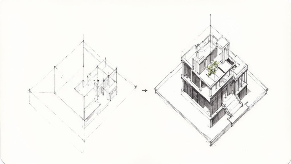
Ever wonder how those jaw-dropping architectural visuals go from a flat blueprint to something you could almost step into? The secret isn't just fancy software; it's a blend of technical precision and a good old-fashioned artistic eye. The whole process starts with building a rock-solid model in a programme like Revit, which is your digital foundation.
From Blueprint to Believable: Creating Your Realistic 3D Drawing in Revit
A truly great realistic 3D drawing is more than just a pretty picture. It’s about building a model in Revit so detailed and accurate that it perfectly communicates your design vision.
This guide is all about getting that foundation right. We'll walk through how to build a clean, data-rich model in Revit, focusing on the little details that make a huge difference. Then, I'll show you how to take that model and really bring it to life with Vibe3D, adding the atmosphere and realism that wins over clients.
Laying the Groundwork in Revit
Think of your initial work in Revit as setting the stage. Everything you do here will directly impact the final render. Revit isn't just for drawing lines; it's a powerful Building Information Modelling (BIM) tool, which means every wall, window, and door you create is packed with real-world information.
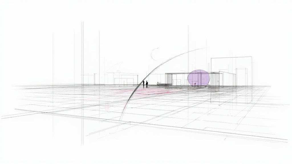
This is where the magic begins.
What you're looking at is the command centre for building a digital twin of your project. A clean, well-organised model from Revit is the absolute best starting point for a high-quality render. If you're curious about other tools, our guide on the best /blog/best-architectural-rendering-software gives a great overview of the options out there.
Why These Revit Skills Matter More Than Ever
The demand for sharp 3D modelling skills is absolutely booming. Just look at the 3D printing and additive manufacturing industry in India, which relies heavily on the kind of precise models we're talking about.
That sector was valued at around USD 20.59 billion in 2025 and is on track to explode to USD 58.67 billion by 2031. This isn't just a niche skill anymore; it's becoming a cornerstone of modern design and manufacturing. You can dig into the specifics in the full report on the Indian 3D printing market.
Build a Solid Foundation in Revit
Before you even think about placing a single wall, the choices you make during your initial project setup in Revit are what separate a good render from a great one. This is your digital groundwork, and getting it right from the very beginning will save you from a world of headaches later on. A truly realistic 3D drawing isn't born from fancy details; it starts with a clean, well-organised model.
Honestly, starting with the right architectural template is a huge time-saver. These templates come pre-loaded with standard views, sheets, schedules, and families, giving you a proper head start. Think of it as the difference between building on solid ground versus starting in the middle of a messy construction site.
Configure Your Digital Environment in Revit
Accuracy is everything. The very first thing I do in any new project is configure the project units. It doesn't matter if you're working in millimetres, metres, or feet and inches—just make sure it's set correctly from the get-go so every component scales properly. Mismatched units are a rookie mistake that can cause a domino effect of problems.
Next up, set a precise geographic location. This isn't just for show. Revit uses this info to calculate accurate sun paths and shadow studies for any time of day, any day of the year. This data is the secret sauce for making the natural light in your model look believable, which is a massive part of achieving realism.
A model's location data doesn't just put it on a map—it connects it to the real world's light and atmosphere. An accurate sun study can reveal design opportunities and flaws you’d otherwise miss until it's too late.
Establish Real-World Levels and Links
To make your model feel like a real building, you need to define its vertical structure. Setting up levels for each floor, the foundation, and the roof height is fundamental. These levels act as reference planes for placing elements like floors, ceilings, and walls, making sure your building’s geometry is logical and precise.
If you’re working on a project with existing site plans or drawings from consultants, managing linked CAD or Revit files is key to staying sane. I've learned a few tricks over the years to keep my project files clean:
-
Always Link, Don't Import: Seriously, always link. Importing bloats your main project file and makes it sluggish. Linking keeps things light and lets you easily update the reference when the source file changes.
-
Use Shared Coordinates: This is a non-negotiable for collaborative projects. It ensures every linked model lines up perfectly in the same coordinate system.
-
Manage Visibility: Get comfortable with the Visibility/Graphics Overrides. You can control exactly which layers or elements from linked files you see, cutting out the visual clutter so you can actually focus.
Getting this foundation right in Revit is the first major hurdle. Once your model is clean and detailed, you can jump into the really fun part—bringing it to life. To see what’s possible, check out our overview of architectural visualization software and discover how tools like Vibe3D can transform your Revit models into stunning, photorealistic renders.
Give Your Revit Model Soul with Custom Materials
If you want a realistic 3D drawing, you have to get the materials right. It’s the single biggest thing that separates a flat, digital-looking model from something that feels real and tangible. We need to move past that default grey look and start telling a story with our surfaces.
This is where we’ll get our hands dirty in Revit’s Material Browser. Don’t worry, creating custom materials that look incredible isn’t some dark art—it’s just about paying attention to the little things. It’s what makes a kitchen model look like a space you could actually cook in, not just a technical diagram.
From Generic to Genuine in Revit
Think about a modern kitchen scene. Any old wood texture will do the job, technically. But a custom one, where you’ve made sure the grain follows the actual construction of the cabinets? That feels authentic. The same goes for appliances; a default metal is just a flat grey, but a custom stainless steel with soft, blurry reflections immediately says "high-end."
Getting this right usually comes down to three main steps: getting the scale of your textures right, faking depth with bump maps, and then dialling in the reflections.
This infographic breaks down that core workflow for taking a boring, flat surface and turning it into a believable material right inside Revit.
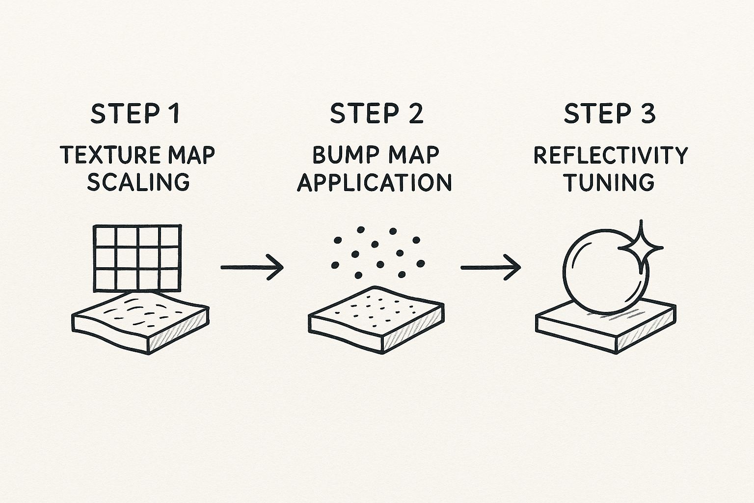
Once you nail this process of scaling, texturing, and tweaking reflections, you'll be able to create materials that look right no matter how you light them.
Key Material Properties to Get Right in Revit
To capture that perfect sheen on a marble countertop or the soft, flat finish of a freshly painted wall, you just need to get comfortable with a handful of settings in Revit.
-
Texture Map Scaling: First, you apply an image texture—think wood grain, concrete, or fabric. The absolute key here is to scale it correctly to match its real-world size. A wood grain that’s massively oversized or comically small is an instant giveaway and completely breaks the illusion.
-
Bump Maps for Texture: This is the magic trick. A bump map is a simple greyscale image that tells Revit what parts of a surface should look raised and what should look recessed. It’s how you get the rough feel of brick or the fine grout lines in a tile floor without having to model any of it. It’s all smoke and mirrors, but it works brilliantly.
-
Reflectivity Tuning: In the real world, almost nothing is perfectly matte or perfectly reflective. Adjusting the reflectivity and glossiness is what makes a surface look like polished chrome versus brushed aluminium, or glossy paint versus unvarnished wood. This one setting has a huge impact on the final render.
Here's a pro tip: always, always start with a real-world photo. Find a picture of the exact material you're trying to make and keep it on your screen. Try to match its texture, how it reflects light, and even its tiny imperfections. It's the fastest way to train your eye for what looks real.
The fundamentals for creating materials in Revit are pretty universal across most 3D software. If you're curious how these same ideas apply elsewhere, we have a great guide on achieving realism in 3ds Max for interior design that you might find useful.
This push for digital realism is making waves in the creative tech world. In fact, India’s slice of the global 3D modelling market is growing fast. The global market is currently around USD 3.36 billion, with the Asia-Pacific region making up 29.4% of that. Within that region, India holds the third-largest share at 11.6%, thanks to our booming IT and creative sectors. You can dig into the numbers yourself in this 3D modelling market report.
By taking the time to master materials, you’re doing more than just making a pretty picture. You’re crafting a convincing digital asset that’s ready for the final, most exciting part: bringing it to life with a stunning render in a tool like Vibe3D.
Master Lighting in Revit to Create Atmosphere
If there's one thing that separates a good render from a great one, it's lighting. I've seen countless meticulously detailed models fall completely flat simply because the lighting was an afterthought. To create a realistic 3D drawing that truly pops, you have to shift your mindset from a modeller to a photographer, all within Revit.
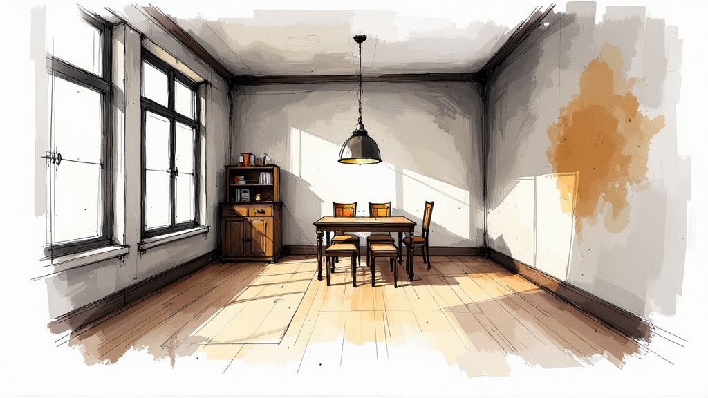
Seriously, even the most basic scene can feel dramatic and inviting with the right light. It’s what turns a technical drawing into an emotional space people feel they can step into. This is where your artistic eye really comes into play.
Let's start with the most powerful light source we have—the sun—before moving inside to shape the mood with artificial lights.
Harnessing Natural Light for Realism
Before you even think about dropping in a single lamp, get your natural light sorted. Revit's sun settings are incredibly robust. By setting the project's actual geographic location, you can simulate the sun's precise path for any time of day, any day of the year.
Think about it: an early morning sun will cast long, gentle shadows, giving off a peaceful vibe. A high-noon sun, on the other hand, creates harsh, direct light that can feel more intense and dramatic. Don't stick with the default settings. Experiment with different times and dates to see how the light and shadows play across your surfaces and define the building's form.
A classic beginner mistake is blasting a scene with too much even light, which kills all the texture and detail. The real magic happens in the contrast. That dynamic interplay between light and shadow is what gives a 3D drawing its depth and believability.
Crafting Mood with Artificial Lights
With your natural light foundation in place, it’s time to bring in the artificial fixtures. This is where your creativity can really run wild. Placing lights like downlights, pendants, or floor lamps isn't just about making a dark room visible; it's about sculpting the space, guiding the viewer's eye, and building a specific atmosphere.
Inside Revit, every light family has settings you can fine-tune:
-
Intensity: This is simply how bright the light is. A word of advice: be subtle. Lights that are too bright look fake and will wash out your beautiful materials.
-
Colour Temperature: Measured in Kelvin (K), this dictates whether the light feels warm (yellowish) or cool (bluish). A cosy living room might benefit from a warm 2700K glow, whereas a clean, modern office would feel right at home with a cooler 4000K light.
Understanding how to choose the right lighting is crucial, no matter which software you're using. If you also work in other ecosystems, you’ll find that many of these principles apply universally. We touch on similar concepts in our guide on how to render in SketchUp, which might be a helpful cross-reference.
Choosing between natural and artificial lighting isn't always an either/or decision; often, the best results come from a thoughtful blend of both. Here’s a quick breakdown to help you decide which to prioritise for your scene.
Natural vs Artificial Lighting Setups in Revit
| Feature | Natural Lighting (Sun Settings) | Artificial Lighting (Light Fixtures) |
|---|---|---|
| Primary Use | Creating a realistic, time-of-day specific environment. Ideal for daytime exterior and interior shots. | Highlighting specific features, creating mood, and illuminating scenes with no natural light. |
| Control Level | Broad control over direction and colour based on location, date, and time. | Granular control over intensity, colour temperature, cone angle, and placement. |
| Emotional Impact | Can evoke feelings of warmth, openness, or drama depending on the sun's position. | Highly versatile; can create anything from a cosy, intimate feel to a stark, clinical atmosphere. |
| Best For | Architectural visualisations, daytime interior design renders, site context studies. | Night scenes, product renders, interior spaces without windows, and dramatic emphasis. |
Ultimately, a balanced scene that feels authentic often uses the sun for the main fill light and then adds artificial fixtures to add depth, interest, and focus.
Framing the Perfect Shot
Finally, remember that your camera setup is just as critical as your lighting. A fantastic lighting scheme can be wasted by a boring composition. Think about how you’re framing the scene. A low camera angle can make a space feel grander, while an eye-level shot creates a more personal, relatable view.
Adjusting the focal length is another pro move. A wider focal length captures more of the room but can introduce perspective distortion. A longer, tighter focal length is perfect for compressing the space and zeroing in on specific design details. And don’t forget depth of field—subtly blurring the foreground or background is a fantastic way to pull the viewer's focus right where you want it.
Transform Your Revit Model Into a Beautiful Render with Vibe3D
So you've poured hours into getting your Revit model just right. The details are there, the lighting is mapped out... now for the fun part. This is where we turn that technically perfect model into a realistic 3D drawing that genuinely wows your clients.
While Revit's own rendering tools can get you part of the way, if you're chasing true photorealism, you'll want to bring in a specialist. That's where a tool like Vibe3D comes in to transform your work into a beautiful render.
Getting your project from Revit into Vibe3D is surprisingly simple. Once your model is imported, you’ll immediately notice how much Vibe3D's features can elevate your work, often with very little manual tweaking. It’s all about adding that last layer of artistic polish that makes an image pop.
From Revit Model to Masterpiece
Making the jump to a dedicated rendering engine is what really unlocks that next level of quality. Vibe3D is built to take the solid foundation you’ve created in Revit and push it further with features designed purely for visual impact.
This shift isn't just about personal preference; it's a reflection of where the industry is heading. In India, AI-powered and cloud-based tools for realistic 3D drawing are becoming the new standard. In fact, by 2025, over 35% of Indian architecture and design firms had already adopted AI-assisted 3D software. For some, this has slashed project turnaround times by up to 40%. The trend towards specialised, powerful tools is undeniable, as you can see from more insights about the future of 3D modeling.
Game-Changing Features for Fast Results
What I love about a dedicated rendering tool is its ability to deliver incredible visuals without a massive time investment. Instead of getting bogged down in complex settings, you can rely on intuitive features that get you 90% of the way there in just a few clicks.
Here are a few things that make a real difference:
-
Advanced Material Library: Vibe3D comes packed with a huge library of physically-based materials. You can literally drag and drop high-quality woods, metals, fabrics, and plastics onto your model. This instantly upgrades the basic Revit materials to something far more convincing.
-
Atmospheric Presets: Want to set a specific mood? Just pick a preset. Whether you need the crisp light of early morning or the warm glow of a sunset, these one-click settings handle all the complex environmental effects for you.
-
A Seriously Powerful Render Engine: Under the hood, Vibe3D is all about speed and quality. It crunches through complex lighting, reflections, and textures way faster than most built-in renderers, giving you high-resolution images in a fraction of the time.
The goal isn't to replace the hard work you did in Revit; it's to honour it. A great rendering tool respects the precision you've already built and gives you the artistic freedom to show it off properly.
This final step is less about technical modeling and more about telling a story. With a tool like Vibe3D, you can finally focus on the art of it all—framing that perfect shot, setting the mood, and creating a visual that truly sells your design.
You can learn more and transform your models into photorealistic visuals with Vibe3D to see what’s possible.
Got Questions About Realistic Renders? Let's Talk.
As you start turning your clean Revit models into jaw-dropping final images, a few questions tend to come up again and again. I've been there. Getting a handle on these common hurdles is key to refining your process and creating a truly realistic 3D drawing. Let's dive into some of the most frequent ones I hear.
Can I Really Get a Photorealistic Drawing Using Only Revit?
Look, you can absolutely get good-quality visuals straight out of Revit. For internal design reviews or clear construction documents, its native rendering tools are often more than enough. They get the job done.
But if you're chasing that wow factor—the kind of photorealism that makes a client do a double-take—then a dedicated platform like Vibe3D is where the magic really happens.
Think of it like this: Revit is your master architect, meticulously building the perfect digital structure. Vibe3D is the professional photographer you bring in to make that structure look its absolute best. You get far more sophisticated lighting controls, a massive library of high-end materials, and a much faster engine. This frees you up to stop wrestling with settings and focus on the artistry of the final shot.
How Big of a Deal Are High-Quality 3D Assets and Families?
Honestly? They're everything. The realism of your entire scene can live or die based on the quality of the bits and pieces you put inside it. Using generic, low-poly furniture or accessories is a dead giveaway that someone is looking at a render, not a photo. It can make an otherwise beautifully detailed drawing feel flat and artificial.
Taking the time to source or build detailed, high-quality Revit families for everything—chairs, tables, plants, light fittings—pays off in a huge way. These little details bring a richness and complexity that makes a space feel genuinely lived-in and believable.
I see it all the time. Beginners obsess over the big architectural elements but then just drop in placeholder assets. A stunning room with a blocky, unrealistic sofa will always look like a render. It just shatters the illusion.
What's the Single Biggest Mistake Beginners Make with Lighting?
Oh, this one's easy. It's forgetting about the light. So many designers pour hours into perfecting models and tweaking materials, only to fall back on flat, default lighting. The result is always the same: an image with no depth, no mood, and zero visual interest.
Great lighting is what actually defines the forms in your scene. It carves out shapes, creates beautiful highlights and shadows, and sets the entire atmosphere. You should always set aside dedicated time to just play with the lighting. Experiment with different sun angles for natural light, and be thoughtful about placing artificial lights to build up a dynamic, layered effect. A simple model can look absolutely incredible with masterful lighting, while a perfect model will always fall flat with bad lighting.
Does My Computer's Performance Actually Affect My 3D Drawings?
Without a doubt. Pushing pixels to create a detailed, realistic 3D drawing is a demanding task for any machine. A powerful CPU, a solid graphics card (GPU), and plenty of RAM are your best friends here. They're crucial for a smooth modelling experience in Revit and for speeding up your render times in a tool like Vibe3D.
You can definitely get by on a mid-range computer, especially when you're just modelling. But when it's time to render, that's when you'll really feel the difference. Investing in better hardware directly translates to more efficiency. It cuts down on those frustrating waiting periods and, most importantly, gives you more time to experiment and refine your work until it’s perfect. A faster machine simply means more time for your creativity to shine.
Ready to see what your Revit models are truly capable of? Vibe3D uses AI to turn your detailed work into breathtaking, client-ready visuals in seconds. Give Vibe3D a try today and see the difference for yourself.