Before you even think about playing with fancy lighting or tweaking textures, you've got to build a solid foundation. This is the unglamorous but absolutely essential part of creating stunning interior 3D renders. It’s all about prepping your digital scene with meticulous care, making sure every plan and model is clean, accurate, and ready to go.
Trust me, getting this right from the start saves you a world of pain later on.
Building the Foundation for Your Render
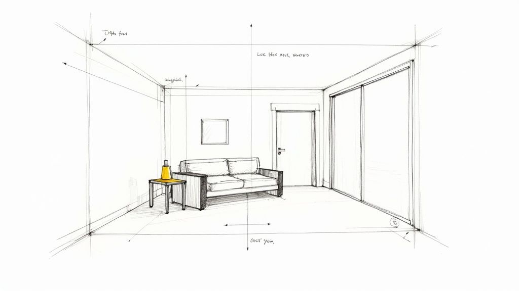
Think of this stage like setting up a real-life photography studio. You wouldn't just throw furniture into a room and hope for the best, would you? You’d measure, place everything perfectly, and make sure the set is clean. The same logic applies here. A messy, disorganised scene is the fastest way to get a frustrating, amateur-looking result.
It all begins with your source files—usually CAD plans or maybe some 3D models you've bought or downloaded. Architectural plans are notorious for having junk data: extra lines, weird layers, and unnecessary blocks that are useless for visualisation. The first job is to get rid of all that clutter. A clean file isn't just easier to navigate; it makes your scene run faster and helps you dodge a surprising number of rendering errors.
Model Optimisation and Scene Organisation
With the base geometry cleaned up, it's time to think about optimisation. That super-detailed designer chair you downloaded might look incredible, but if it has a million polygons, it's going to grind your whole project to a halt. High-poly models are a major cause of slow viewports and sky-high render times.
The trick is to simplify geometry where it won't be noticed. A decorative vase tucked away on a shelf in the background doesn't need nearly the same level of detail as the statement armchair right in the foreground. It’s about being smart with your polygon budget. For a much deeper look into how to handle this in specific software, our guide on 3ds Max for interior design has some great, practical tips.
Good organisation is just as vital. I always use a clear layering system to keep things manageable. It might look something like this:
-
Architecture: Walls, floors, ceilings, doors, windows
-
Furniture: Sofas, tables, chairs, beds
-
Lighting: All your light sources, from the sun to a table lamp
-
Décor: The little things—plants, books, cushions, and other accessories
This simple structure lets you instantly hide, isolate, or tweak specific elements without accidentally messing up the rest of your scene. It’s a lifesaver.
Key Takeaway: A well-organised scene isn’t just about being tidy; it’s the backbone of an efficient workflow. Proper layering and smart model optimisation can genuinely cut your project time by up to 25% by slashing rework and avoiding technical snags.
Setting the Correct Project Units
Now for a step that's so easy to forget but so critical: setting your project units and system scale correctly. This is non-negotiable. If your scene is set to inches but your imported models are in centimetres, everything will be chaos.
Why does it matter so much? Because lighting calculations, texture mapping, and even physics simulations all rely on accurate, real-world measurements. Get the scale wrong, and you'll see textures stretching bizarrely or lights behaving in completely unnatural ways. It's a small check that prevents massive headaches.
This simple workflow sums it up: start with a clean plan, build your model, and double-check your units.
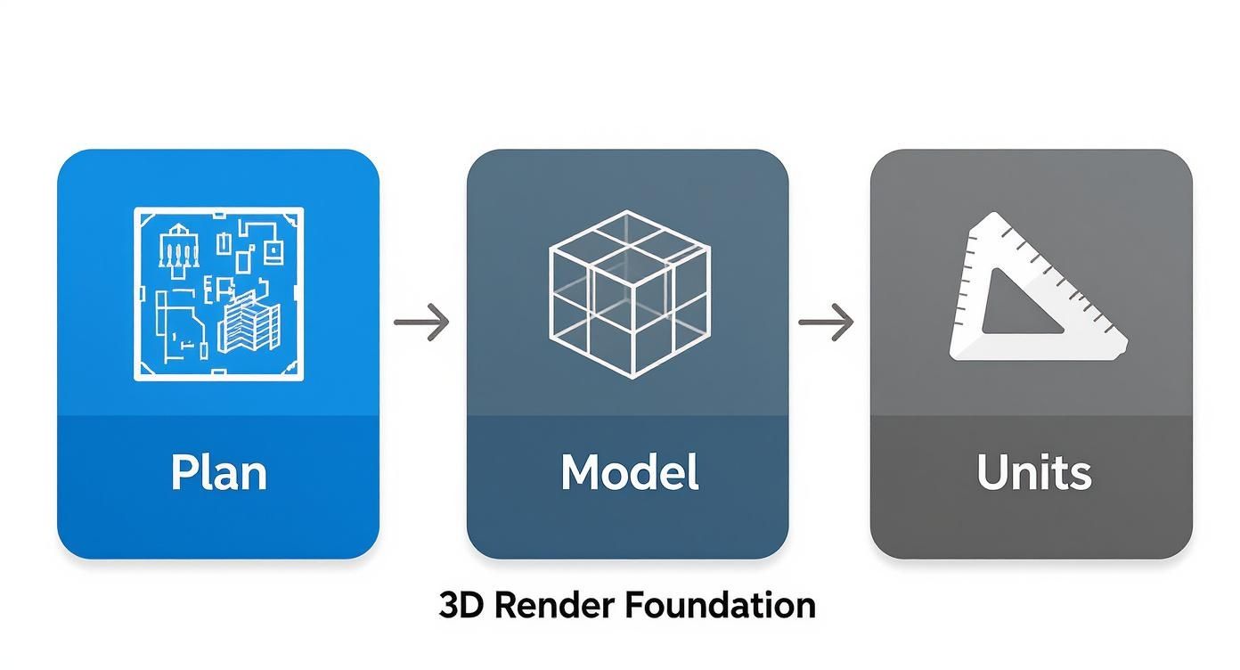
Nailing this sequence means your technical foundation is solid, giving you a reliable base to build your creative vision upon. If you're curious about the tech behind all this, this guide with CGI and animation explained is a great read for some background context.
Creating Lifelike Materials and Textures
With your scene prepped and scaled, it’s time for the magic to happen. This is where you breathe life into the geometry, turning a collection of sterile shapes into a space that feels real and lived-in. Materials and textures are what tell the story. A default grey material is just a placeholder; a rich, dark walnut texture with a subtle sheen instantly communicates quality and style.
The secret to photorealism in interior 3D renders isn't just about finding a nice picture of wood. It’s about building up layers of detail that mimic how that wood would behave in the real world. A wooden floor isn't just a flat brown colour—it has a distinct grain, tiny imperfections, and a particular way it reflects the light from a nearby window.
Getting a Grip on Texture Maps
To build this kind of realism, we rely on a series of images known as texture maps. Think of them as a set of instructions. Each map tells the render engine how to handle a specific property of the surface, adding layers of complexity that ultimately fool the eye. Getting comfortable with the main players here is an absolute must.
The most critical maps you'll work with are:
-
Diffuse or Albedo: This is your base. It's the core colour and pattern—the image of the wood grain, the veining in the marble, or the weave of the fabric.
-
Roughness or Glossiness: This map is all about how light interacts with the surface. A perfectly smooth mirror will have very low roughness, letting light bounce off cleanly. In contrast, an unpolished concrete floor has high roughness, scattering the light in all directions.
-
Bump or Normal: These are fantastic because they create the illusion of fine detail and depth without you having to model it. This is how you get the subtle texture of leather or the raised grain in a piece of oak, making a flat surface look three-dimensional.
When you start combining these, your materials really start to sing. For instance, that wooden tabletop might use a diffuse map for the oak pattern, a custom roughness map with faint smudges to break up the reflections, and a normal map to make the grain pop.
To help you get started, here's a quick breakdown of the most common texture maps you'll encounter.
Key Texture Maps and Their Purpose
| Map Type | Primary Function | Real-World Example |
|---|---|---|
| Diffuse / Albedo | Defines the base colour and pattern of a surface. | The pattern on a floral wallpaper or the image of wood grain. |
| Roughness / Gloss | Controls the scattering of light; matte vs. shiny. | A polished marble floor (low roughness) vs. a terracotta tile (high roughness). |
| Normal / Bump | Simulates fine surface detail and texture. | The tiny bumps on a leather sofa or the grout lines between tiles. |
| Displacement | Physically alters the geometry at render time for extreme detail. | A highly detailed stone wall or the deep treads on a rug. |
| Metalness | Dictates whether a material behaves like metal or a dielectric (non-metal). | Distinguishes between chrome tapware and a ceramic sink. |
| Opacity | Controls transparency. | A sheer curtain, a frosted glass panel, or the leaves on a plant. |
Think of these maps as ingredients in a recipe. The better you understand how each one contributes to the final dish, the more control you'll have over the final look and feel of your render.
Sourcing and Applying High-Quality Textures
Your final render is only as good as the textures you use. Low-resolution, blurry, or repetitive textures are a dead giveaway that you're looking at a computer-generated image. Thankfully, there are tons of brilliant resources out there, both free and paid, where you can find high-quality, seamless textures.
Once you’ve found the perfect texture, the next hurdle is applying it correctly. This involves a process called UVW mapping. In simple terms, this is a set of coordinates that tells the software exactly how to wrap your 2D texture image around your 3D object. Get this wrong, and you'll see those classic CG mistakes—like stretched wood grain on the side of a cabinet or a distorted pattern on a throw pillow. Taking the time to properly unwrap your UVs is a non-negotiable step for ensuring your materials flow naturally over every surface.
Creating convincing digital materials often means looking at their real-world counterparts for inspiration. Understanding how a physical material works can massively inform your digital texturing choices, especially when you're looking at things like choosing vinyl wrap for kitchen cabinets and trying to replicate that finish digitally.
This level of detail is becoming increasingly important. The interior 3D rendering field is expanding rapidly, especially in places with a hot property market. In fact, India is projected to have the highest growth rate in the global interior residential design 3D rendering market between 2025 and 2033. For great models to apply these textures to, our guide on using the 3D Warehouse in SketchUp is a great place to start.
Illuminating Your Scene Like a Professional
If materials give a scene its soul, then lighting is what breathes life into it. This is, without a doubt, the most powerful tool in your arsenal for setting the mood, creating drama, and nailing that photorealistic look everyone is after.
It doesn't matter how perfect your models or textures are; bad lighting will make everything look flat and fake. It's time to stop thinking like a modeller and start thinking like a professional photographer.
The trick is to build up light in layers, just as you'd find in a real space. Forget about relying on a single, harsh light source. We're going for a more nuanced approach, one that replicates both the soft, ambient light of an environment and the crisp, direct light from the sun.
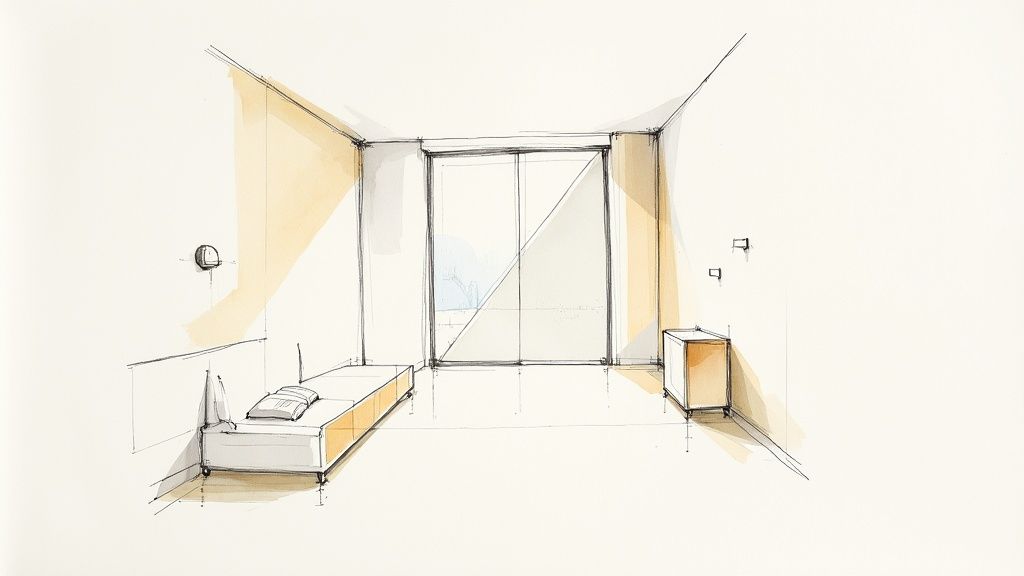
Crafting Natural Environmental Light
For soft, believable ambient light, especially when you have large windows, a High Dynamic Range Image (HDRI) is your best friend. Think of an HDRI as a 360-degree photograph that wraps around your entire scene, casting realistic light and reflections onto every surface. It’s a shortcut to a natural-looking base level of illumination that is incredibly tough to fake by hand.
You have a couple of solid options for creating natural light:
-
HDRI-Based Lighting: This is where you let an HDRI map do all the heavy lifting as the primary light source. It’s fantastic for creating those soft, diffused shadows and subtle colour shifts you see on an overcast day or in rooms that aren't getting direct sun. The light feels real because it is real—it's captured from a genuine environment.
-
Sun-and-Sky Systems: Almost every render engine comes with a built-in system that simulates the sun and atmosphere. This is your go-to for creating sharp, defined shadows and that warm glow of a sunny afternoon. You get total control over the time of day and the sun's position, letting you direct exactly how light streams into the room.
From my experience, the best results often come from mixing the two. Use a sun system for that strong, directional light and then add a subtle HDRI to fill in the shadows and make everything feel more connected.
Layering Artificial Lights for Mood
Once you have the natural light sorted, it’s time to bring in the artificial lights. These are the elements that transform a generic room into an inviting, lived-in space.
Take a moment to think about all the light sources in a real home: the under-cabinet LEDs in a kitchen, a warm table lamp next to a sofa, or the spotlights highlighting a piece of art. Each one adds another layer of depth and visual interest.
By layering artificial lights, you guide the viewer's eye and build a narrative. A spotlight on a feature wall or a soft glow from a bedside lamp makes the space feel intentional and lived-in, transforming a simple render into a compelling image.
This is a skill that's becoming more valuable by the day. The market for interior 3D renders is growing fast, particularly in India, thanks to a boom in construction and rapid urbanisation. The Asia Pacific region is expected to lead global growth, with a projected CAGR of around 18%. You can explore more about this market expansion in the full research about the 3D rendering service market.
Mastering Exposure and White Balance
Finally, you need to tell your "digital camera" how to see all this beautiful light you've created. Just like with a real camera, exposure is everything. An overexposed image will look washed out and blown out, while an underexposed one will lose all the important details in the shadows. Tweak your exposure settings until you strike that perfect balance, with a good, clean range from darks to lights.
White balance is just as crucial for realism. Different light sources have different "colour temperatures"—daylight is cool and blueish, while an old incandescent bulb is warm and yellow. Setting the correct white balance ensures that the whites in your scene actually look white, which grounds the entire image and makes it feel much more believable.
For artists using SketchUp, finding software that gives you this level of control is key. Our list of the best rendering software for SketchUp is a great place to start exploring options with advanced lighting features.
Composing Your Shot for Maximum Impact
You can have the most realistic materials and perfect lighting, but if the composition is off, the final render will just feel… flat. This is the moment you stop thinking like a 3D artist and start thinking like an architectural photographer. How you frame the shot is every bit as crucial as the textures you apply.
The idea is to purposefully lead the viewer's eye through the room, telling a story about the design. A carefully composed shot feels intentional, draws you in, and ultimately makes the space far more compelling.
Applying Photographic Principles
This is where leaning on classic photography rules really pays off. They give you a solid foundation for creating images that are balanced and visually interesting. The rule of thirds is a great place to start. Picture a 3x3 grid over your viewport; by placing a key feature, like a standout piece of furniture or a bold artwork, along these lines or where they cross, you create a much more dynamic image than if you just plonked it in the centre.
Another fantastic technique is to look for leading lines. These are lines that already exist in your scene—the edge of a countertop, a pattern on a rug, or even beams on the ceiling. Use them to guide the viewer’s gaze towards the focal point of your render. It’s a simple trick that adds a surprising amount of depth and makes your interior 3D renders feel more immersive.
A great composition doesn't just show a room; it tells a story about how the space is meant to be used and experienced. It transforms a static image into an invitation.
Selecting the Right Lens and Height
The virtual camera settings you choose will completely change how the room feels. Your focal length, or "lens," is a big one. It’s always tempting to go for a super wide-angle lens to cram as much of the room into the frame as possible, but this usually backfires, leading to weird, distorted perspectives where everything at the edges looks stretched and unnatural.
For the vast majority of interior shots, sticking to a focal length somewhere between 24mm and 35mm will give you a natural-looking field of view without that ugly distortion. This range is much closer to how our own eyes see a space, making it feel instantly more believable.
The camera's height is just as important for setting the tone:
-
Low Angles (waist height): Setting the camera about 75-100cm off the ground can make a room feel much grander and more dramatic. It’s a brilliant way to add a sense of scale or draw attention to a high ceiling or a feature light fitting.
-
Eye-Level Angles (standard height): A camera placed between 150-170cm gives a very natural, "standing in the room" perspective. It’s a reliable and effective go-to for most general-purpose shots.
Finalising Renders and Post-Production Magic
So, you’ve meticulously built your scene, crafted beautiful materials, and dialled in the lighting. Now it's time to bring it all home. This final stage is a balancing act, blending the technical side of render settings with the artistic finesse of post-production. This is where a good render truly becomes a great one.
A lot of artists get bogged down here, obsessively tweaking render settings for hours on end, chasing that elusive "perfect" setup. Let me tell you from experience: the goal isn't perfection; it's efficiency. You need a clean, noise-free image that doesn't take days to finish.
The real key is understanding the trade-off between quality and time. I always recommend focusing your energy on optimising sampling and noise reduction. Start with low-quality test renders to confirm your lighting and composition are spot-on, then crank up the settings only for the final output. Using a denoiser is absolutely non-negotiable in a modern workflow—it intelligently cleans up any leftover noise, letting you get away with much faster render times.
The Power of Post-Production
Once your raw render is finished, the real magic can begin. This is where you elevate your interior 3D renders from being just technically accurate to becoming emotionally resonant. The secret weapon for gaining maximum control is rendering out separate elements, which you'll hear called "render passes" or "render elements."
Instead of one single, flattened image, you export individual layers for things like:
-
Reflections: Gives you complete control over the intensity of every reflective surface. Is that chrome tap too bright? Fix it in post.
-
Shadows: Lets you deepen or soften shadows to crank up the drama and contrast.
-
Ambient Occlusion: This is a big one. It adds those subtle contact shadows where objects meet, which does a massive job of grounding everything in the scene and boosting realism.
-
Lighting: You can separate different light sources, allowing you to adjust them independently without re-rendering.
Working with these passes in a program like Photoshop is a complete game-changer. It means you can easily tweak the brightness of a lamp or the intensity of a window reflection without having to go back and re-render the entire scene—a process that could eat up hours of your day. This non-destructive workflow gives you incredible creative freedom.
Key Takeaway: Post-production isn't just for fixing mistakes; it's for adding artistry. By separating your render elements, you gain precise control to fine-tune colour, contrast, and atmosphere, turning a good image into a captivating one.
A Simple and Effective Workflow
With your render passes loaded into your favourite image editor, you can start polishing. I usually start with colour grading. This is where you set the overall mood and tone of the image. A slight warming filter can make a living room feel cosy and inviting, while a cooler, more desaturated look might be perfect for a minimalist, modern kitchen.
Next, I like to add some subtle lens effects. A hint of chromatic aberration on the edges or a very gentle vignette can mimic the natural imperfections of a real camera lens. It’s a small detail that subtly tricks the viewer's eye into seeing the image as more photographic. Sharpening is the final touch, but be gentle—overdo it and the image will look brittle and artificial.
This detailed approach to creating interior 3D renders is gaining ground everywhere. In fact, India's interior 3D design software market is seeing major growth as both local and global platforms start catering to the unique needs of the region's designers. This trend is picking up speed thanks to the rise of small and medium-sized studios, which are using flexible software models to access powerful tools without huge upfront costs.
Ultimately, this final stage is all about creative iteration. New tools are even popping up to help you explore different looks much faster. To see how new technologies are shaking up this space, check out our guide on the potential of AI in rendering.
A Few Common Questions About Interior 3D Renders
Even when you've got a solid process down, certain questions always seem to surface, particularly when you’re trying to elevate your interior 3D renders from good to truly photorealistic. Here are a couple of the big ones that artists and designers grapple with.
How Long Does a High-Quality Interior Render Actually Take?
This is the classic "how long is a piece of string?" question, but I can give you a realistic ballpark. A straightforward room scene, especially if you’re using some pre-made assets, might land in the 10-20 hour range from start to finish. That includes everything from initial setup to the final tweaks in post-production.
On the other hand, a complex, high-end space with custom-modelled furniture, detailed styling, and a sophisticated lighting setup can easily demand 40+ hours of focused work. The actual render time—when your machine is doing the heavy lifting—can also vary wildly. A quick draft might take 30 minutes, but a final, high-resolution hero shot could easily cook for several hours, all depending on your hardware and the quality you're aiming for.
What’s the Best Software for Interior Rendering?
Honestly, there’s no single "best" tool out there. It really comes down to finding a workflow that clicks for you and your team. Most professional studios build their pipeline around a primary modelling program like 3ds Max, Cinema 4D, or SketchUp, paired with a powerhouse render engine like V-Ray or Corona Renderer.
Of course, Blender is an incredibly popular and powerful free option that can produce breathtaking results. The best software is ultimately the one you’re willing to master. If you want to dive deeper into the options, our guide to the top architectural rendering software really unpacks the pros and cons of the leading contenders.
The secret to escaping that sterile, uncanny "CG look" is embracing imperfection. Nothing in the real world is perfectly clean or flawless. Adding subtle smudges to glass, a light layer of dust on a shelf, slight variations in a wood grain, or realistic folds in fabric is what sells the illusion.
These small, deliberate details, when combined with soft and natural lighting, are what transform good interior 3D renders into photorealistic art. It’s about tricking the viewer's brain into seeing a photograph, not just a digital image.
Ready to slash your rendering time and iterate on designs faster than ever? Vibe3D uses AI to turn your detailed models into photorealistic visuals in seconds, not hours. See how it can fit into your workflow at https://vibe3d.ai.